West
Finale Katara 
Posts: 8,335
|
Post by West on Sept 12, 2008 21:29:45 GMT -5
#1  #2  #3  #4  #5  #6  #7[  #8  #9  #10  #11  #12  #13  #14  #15  #16  #17  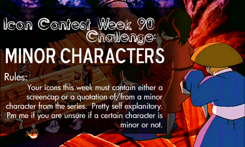 |
|
Kana
Yu Yan Archers 

Posts: 5,728
|
Post by Kana on Sept 12, 2008 21:49:02 GMT -5
Its between 3, 5, 6 and 7. All beutiful. But the lighting and crop of 5 just amaze me.
|
|
|
|
Post by goten0040 on Sept 12, 2008 22:00:49 GMT -5
I'm going with 13. I like the crop and the color quite a bit.
|
|
|
|
Post by nymphadora on Sept 13, 2008 10:23:16 GMT -5
I love 5 too. The colors and lighting and effect in the lower left corner look so good. 7 was my second favorite. I like the crop of 8 a lot, but I think the text takes away from it. If I take it away in my mind, it's probably tied with 5.  |
|
~*~WhItEsHeEp~*~
Appa  Honorary Maiko Fan
**...and he came from a family full of black sheep...**
Honorary Maiko Fan
**...and he came from a family full of black sheep...**
Posts: 222
|
Post by ~*~WhItEsHeEp~*~ on Sept 13, 2008 17:15:51 GMT -5
im gonna have to go with 5 and 10, although there are some really good ones. ^_^ Ill vote for 10, its not to fancy, but it still looks good.
|
|
|
|
Post by Musogato on Sept 13, 2008 17:32:16 GMT -5
I really like #2 -- how the dark right side makes Jeong Jeong stand out more while also making his shadows look more dynamic. (The dynamic shadows in #5 are great too) The tiny text and tiny light texture are nice as well, though it could have been a little more brighter imo so it's a little more noticeable.
I also really like the vibrant coloring and cropping for #6, #7, #8, and #13. Very pretty. ^^ The coloring for #1, #3, #9, and #17 are nice too, as is the cropping for #15.
Additionally, I like the cropping and text/dot texture placement for #16, but the text color makes it hard to read and Song looks a little too washed out.
|
|
|
|
Post by darkblood_alchemist on Sept 13, 2008 17:46:15 GMT -5
#3 -- lovely crop, lovely color/contrast
I also liked #5, but I feel like the texture/effect on the lower left is unnecessary and detracts from the icon. It also looks a little out of place. :/
I like the crop and coloring on it though.
|
|
random bender
Appa
Gone for ever back again! are you happy? ^^
Posts: 201
|
Post by random bender on Sept 13, 2008 19:57:43 GMT -5
i voted for 13
Please add more to your posts than this. There is a thread that you can read if you are unsure how to post here.
|
|
Aanglover
Avatar Yangchen  The Aang Guru
 This isn't the end, but rather, a new beginning.
Posts: 1,537
|
Post by Aanglover on Sept 14, 2008 5:25:17 GMT -5
mmm.. i'm gonna have to say it's between 1, 3, and 13...
but since i like the crop and yue more... i'm going with 3.
|
|
random bender
Appa
Gone for ever back again! are you happy? ^^
Posts: 201
|
Post by random bender on Sept 18, 2008 10:36:32 GMT -5
4 and 14 look like they have way too much stuff on them who agrees?
|
|
|
|
Post by bagpipe turtle on Sept 18, 2008 14:07:51 GMT -5
I voted for 6- I think the coloring is lovely, and it is a very good crop. I also like 5 and 13.
|
|
West
Finale Katara
Posts: 8,335
|
Post by West on Sept 19, 2008 21:49:16 GMT -5
ZOMG ... again?!!
This contest will need to stay open for another week, like the last one.
This week's contest has a six way tie for first, so you may now only vote for: #2, #3, #5, #6, #7, #8.
Wow, I can't believed that that happened again.
|
|
~*~WhItEsHeEp~*~
Appa
Honorary Maiko Fan
**...and he came from a family full of black sheep...**
Posts: 222
|
Post by ~*~WhItEsHeEp~*~ on Sept 21, 2008 14:51:35 GMT -5
there must be some way we can get more of the people to vote, its seems like its always the same handful of people. does knowone care?!?!?!
|
|
West
Finale Katara
Posts: 8,335
|
Post by West on Oct 4, 2008 18:56:09 GMT -5
Voting Closed!
Winners are:
1st Place: West
2nd Place: Aanglover
Congrats to the winners!
I also need a staff member to pm me with the icon they think is the best for the 'Mod's Choice' icon. The only icons that one cannot pick are #2 & #6.
|
|