West
Finale Katara 
Posts: 8,335
|
Post by West on Sept 5, 2008 23:49:04 GMT -5
Icon Discussion #1 | Areas of Critique | Score (1-10) | Average: | 25 |
How This All Works... I will post a new icon on Friday night/Saturday for these discussions. Each icon will be left up in the discussion thread for about a week, so you all can freely talk about whatever you want (that pertains to the icon). Rules 01. Anyone is allowed to post in this thread, as long as it is to discuss said icon. 02. When making your comments, try to have both good and bad aspects of the icon. 03. Do not bash, or make fun of another icon. 04. Keep it kid-friendly. No swear words. 05. Respect other people's opinions. You are free to disagree, but you may not bash someone else's opinion. 06. Feel free to be bluntly honest. This thread isn't here to hurt feelings, but it is to discuss icons, whether you think that they are good or bad. 07. Have a fun time critiquing. When making your post, I would like you to have at least table filled out. I also have the coding at the end, so you can just copy and paste it into your post: When filling in your scores, please make them on a scale of 1 - 10, 10 being the best (highest), and 1 being the worst (lowest). | Areas of Critique | Score (1-10) | Crop | -- | Coloring | -- | Brushes/
Textures | -- | Text | -- | TOTAL: | -- |
Please only fill out the score box if it is applicable; meaning if there is not text on the icon, then leave that box blank. [ text consists of placement, coloring, font, etc. TINY TEXT DOES NOT COUNT AS TEXT! ] [center][table][tr][td]Areas of Critique[/td][td]Score (1-10) [/td][/tr]
[tr][td][center]Crop[/center][/td][td][center]--[/center][/td][/tr]
[tr][td][center]Coloring[/center][/td][td][center]--[/center][/td][/tr]
[tr][td][center]Brushes/
Textures[/center][/td][td][center]--[/center][/td][/tr]
[tr][td][center]Text[/center][/td][td][center]--[/center][/td][/tr]
[tr][td][center][b]TOTAL:[/b][/center][/td][td][center]--[/center][/td][/tr][/table][/center] |
|
Aanglover
Avatar Yangchen  The Aang Guru
 This isn't the end, but rather, a new beginning.
Posts: 1,537
|
Post by Aanglover on Sept 6, 2008 10:18:04 GMT -5
| Areas of Critique | Score (1-10) | Crop | 10 | Coloring | 8 (a little too overcolored 4 my taste) | Brushes/
Textures | 10 | Text | -- | TOTAL: | 28 |
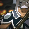
overall, i like it, the pose of azula, the texture, but i think that the color is a little too saturated.. if it was a little bit less colorful i think it would look better; but that's IMO.
|
|
|
|
Post by syarafire on Sept 6, 2008 13:53:54 GMT -5
| Areas of Critique | Score (1-10) | Crop | 9 | Coloring | 8 | Brushes/
Textures | 10 | Text | -- | TOTAL: | 27 |
The crop is really good, but after looking at it a while, it seems a tiny bit awkward to cut the cap off right at Azula's nose. But I know the intent was to make it so only one of her eyes was in the icon, and the icon pulls that off very well. The coloring is very nice, but the image looks a bit oversharpened around the eyes and especially the hair. I'm not sure whether the red areas come from the coloring or from a texture, but that seems a little awkward too. Overall, a really nice icon. I love the sort-of subtle light texture and the tinytext. |
|
West
Finale Katara
Posts: 8,335
|
Post by West on Sept 6, 2008 14:59:47 GMT -5
I guess that I should have explained this too.
In your charts, when I mean total, I meant all the numbers added together. So that the final number would be your score out of 40 (or in this specific case 30).
|
|
|
|
Post by syarafire on Sept 6, 2008 15:01:43 GMT -5
Oh, rofl.
I thought that at first, but the title of the column was score (1 - 10), so I was a little confused and just took the average. Editing.
|
|
|
|
Post by night on Sept 6, 2008 15:33:05 GMT -5
| Areas of Critique | Score (1-10) | Crop | 8 | Coloring | 7 | Brushes/
Textures | 8 | Text | -- | TOTAL: | 23 |
My main issue with this icon is the extensive over-sharpening. It takes a lot away from the icon, and my attention is drawn to that rather than the icon itself. The coloring is nice, but not that appealing to me. Also, the addition of the center brush is nice, but the brush in the upper-left corner is unnecessary and makes the icon seem busier than it should be. Perhaps if the icon wasn't overly-sharpened and busy, it would be nicer. |
|
West
Finale Katara
Posts: 8,335
|
Post by West on Sept 6, 2008 16:06:38 GMT -5
Not exactly for that purpose Shockie. The discussions are just for the people here to talk about graphics and things/techniques they like/don't like about all sorts of different icons. I get what you mean, because I am sure I know exactly what you are thinking. To start out, I thought I would just post some random icons, so that these discussions could pick up, and people could get used to doing them. Later, I hope that people will make icons and send them into me so that they can be put here too.
But, just to start, just some random icons. :D
Also, don't be afraid to talk about other people posts either. Discussions involve you posting more than once, so please do.
|
|
West
Finale Katara
Posts: 8,335
|
Post by West on Sept 6, 2008 16:16:46 GMT -5
Well, my main reason for these weren't really for the maker benefit pre-say.
It is good that the maker finds it useful, but it is more for people who like graphics to talk about them. I want people to say that they like this coloring, but think that that texture seems out of place with the rest of the icon. That way, people can see different areas of icons with different styles. So if people see that people like this certain technique, then they could try that in one of their icons.
But yeah, I would like to have people to start submitting by the fourth discussion (icon).
|
|
|
|
Post by night on Sept 6, 2008 16:17:15 GMT -5
I agree with Shockie. Personally, I'd dislike it if one of my ancient icon from years ago was used (though feel free to use any awesome ones of mine ;D). I'd love to eventually be able to submit icons, but that method has the possibility of getting backed up if too many people want critiques! xD
|
|
Ghiaccio
Aang  Apparently Sokka's my best muse.
Posts: 57
|
Post by Ghiaccio on Sept 6, 2008 20:34:14 GMT -5
| Areas of Critique | Score (1-10) | Crop | 8/10 | Coloring | 6/10 | Brushes/
Textures | 5/10 | Text | -- | TOTAL: | 19/30 |
The crop though interesting I wish it showed the rest of her nose. It would've been more complete to me. The coloring is a bit overdone, by it being overly saturated. The brushes and textures to me, look sloppy and misplaced. It makes the icon look cluttered and over worked. Like they were trying to pull out all their goodies at once. Overall, It's okay. I'm not a huge fan. Doesn't make my inner Avatard + Graphic geek squeal with joy. |
|
~*~WhItEsHeEp~*~
Appa  Honorary Maiko Fan
**...and he came from a family full of black sheep...**
Honorary Maiko Fan
**...and he came from a family full of black sheep...**
Posts: 222
|
Post by ~*~WhItEsHeEp~*~ on Sept 8, 2008 13:45:52 GMT -5
| Areas of Critique | Score (1-10) | Crop | 7 | Coloring | 10 | Brushes/
Textures | 10 | Text | 9 | TOTAL: | 36 |
over all I really like this icon, especially the textures and colors, but i dont really like the way the crop cut off part of azulas head |
|
|
|
Post by beautyfr.pain on Sept 8, 2008 15:59:26 GMT -5
| Areas of Critique | Score (1-10) | Crop | 7 | Coloring | 7 | Brushes/
Textures | 9 | Text | -- | TOTAL: | 23/30 |
I actually really like the coloring of this icon. There is too much saturation at some parts (like in her hair) but I actually like the coloring. It's really smooth and I almost can't imagine it coming from a screenshot of the show. The brush use was pretty unique IMO, like the asterisk. I think the crop is pretty decent, and it's not like she's suppose to be all there. When I see it, I kind of wonder what she's looking at [lame, i know] but I think I would have nudged it a tiny bit to the left. jinfan made this, right?[/size] =X |
|
Kana
Yu Yan Archers 

Posts: 5,728
|
Post by Kana on Sept 12, 2008 18:03:58 GMT -5
| Areas of Critique | Score (1-10) | Crop | 8 | Coloring | 8 | Brushes/
Textures | 8 | Text | -- | TOTAL: | 24 |
I have to say I have always loved this icon. It doesn't even look like a cap from the show, which is why it is one of my favorites. Crop: I like the crop, kinda mysterious, and very Azula. But it leaves more to be desired. Maybe show her nose a bit more. Coloring: Like the pinks, but its almost too bright. Almost. Brushes/Texture: Very lovely, it all seems to fit. But its over saturated in some areas, which is distracting. |
|
|
|
Post by night on Sept 12, 2008 18:15:13 GMT -5
@bfp - Yes, I do believe Jinfan made it. Otherwise my memory is fail. D:
|
|
West
Finale Katara
Posts: 8,335
|
Post by West on Sept 12, 2008 21:01:31 GMT -5
Yes, night, you are correct. It was indeed made by Jinfan, quite a while ago. I loved this icon for a long time, and I can say that I doo like looking back to it. I thought that it would be a good one to start with. It is now time to close this discussion. Hopefully this was all ok for everyone, and that everyone sort of now has an idea as to how to post in these. | Areas of Critique | Score (1-10) | Average: | 25 |
These threads will also be unlocked (for now) so that if anyone feels the urge to reply they can. |
|