West
Finale Katara 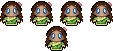
Posts: 8,335
|
Post by West on Aug 29, 2008 22:46:59 GMT -5
#1  #2  #3  #4 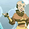 #5 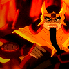 #6 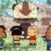 #7 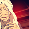 #8 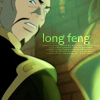 #9 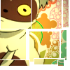 #10  #11 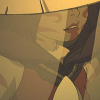 #12 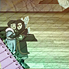 #13  #14  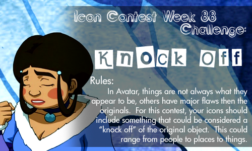 |
|
|
|
Post by goten0040 on Aug 29, 2008 22:54:48 GMT -5
I was torn between 2, 13, and 14, but I think I'll go with 13.
|
|
Kana
Yu Yan Archers 

Posts: 5,728
|
Post by Kana on Aug 29, 2008 23:57:33 GMT -5
Hmm. . . I really like 2, 10 and 11. . . I'll go with 2, I really love its crop and coloring.
|
|
Ghiaccio
Aang  Apparently Sokka's my best muse.
Posts: 57
|
Post by Ghiaccio on Aug 30, 2008 7:07:22 GMT -5
When the icons first loaded, #8 just popped out for me.
Nice crop and coloring. I love the colorsss :3
Though I like a lot of the others like 3, 5, 7, 11, & 13.
|
|
|
|
Post by Scarlett Ember on Aug 30, 2008 13:16:42 GMT -5
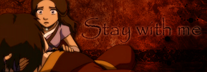
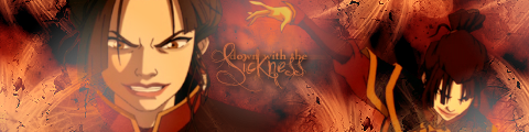
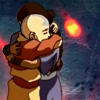
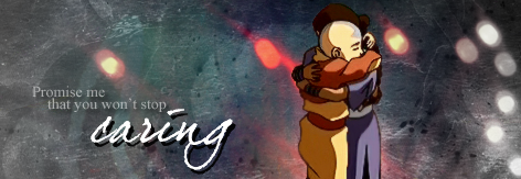
#1 - The coloring is nice, but it's just rather boring.
#2 - Love the crop, but it's a little too soft and doesn't stand out.
#3 - The crop is really cool, and so is the coloring, but I had to look at it for a little while before I figured out what it was.
#4 - It's really funny, though I'm not really a big fan of animated icons, unless it's subtle. I like still ones with nice coloring and effects rather than an animated one with simple pictures and words.
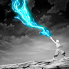
#5 - Nice crop, and the coloring is certainly bright and fitting. It's a good icon.
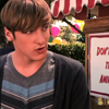
#6 - Cute screencap, and I think the texture on it is cool, but the text looks odd.
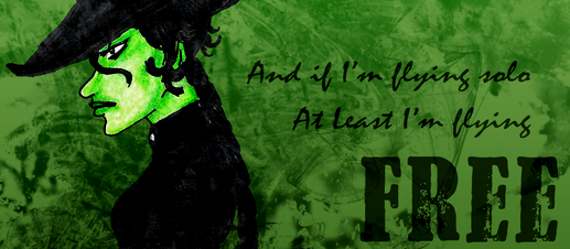
#7 - The contrast between Hama and the background is nice, though she looks a little washed out. It's pretty, but there isn't anything that makes it stand out.
#8 - The coloring is perfect, and a very nice use of text.
#9 - Great crop, and the colorful background is very fitting. The effect with the boxes is really nice, and I think it works perfect with the puppet!momo.
#10 - Good crop, but there really isn't anything special about it.
#11 - The crop is nice, and I absolutely love the coloring! It gives the icon a very nice effect.
#12 - I like the crop, but I think the notebook and line part doesn't fit, and overpowers the icon.
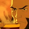
#13 - The lighting is nice, and gives a nice contrast of the bluish gray and the character. The crop is pretty predictable, but it fits.
#14 - Like I said, I am not a big fan of animated ones since it's just screenshots and words, which to me is rather boring. The focus is on the joke, and not the look of the icon. Funny, though.
My favorites are in bold. I narrowed it down to #9 and #11. I ended up picking #9.
|
|
Aanglover
Avatar Yangchen 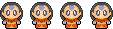 The Aang Guru
 This isn't the end, but rather, a new beginning.
Posts: 1,537
|
Post by Aanglover on Aug 31, 2008 13:12:28 GMT -5
it'd have to be across between #11 and 13 because of the great cropping and coloring used..
but i'm gonna have to go with 13.
|
|
|
|
Post by ILZ on Sept 1, 2008 22:57:44 GMT -5
9 and 13 are both great. I like how even the shape of 9 fits the theme. The coloring of 13 is really pretty.
|
|
|
|
Post by nymphadora on Sept 1, 2008 23:08:49 GMT -5
I didn't really notice 11 at first, but the more I look at it the more I love it. I love how in the screenshot she looks like she's holding her breath so no one hears her - and that adds to the soft and gentle look to it.  So my vote's for 11, but 5 is my second favorite. |
|
West
Finale Katara
Posts: 8,335
|
Post by West on Sept 5, 2008 23:17:00 GMT -5
Voting is closed!
Winners are:
1st Place: Kana
2nd Place: West (#8)
2nd Place: Frizz (#9)
Congrats to all the winners!
|
|


 So my vote's for 11, but 5 is my second favorite.