West
Finale Katara 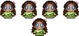
Posts: 8,335
|
Post by West on Aug 2, 2008 12:14:19 GMT -5
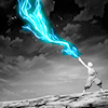
Some people figured out the contest! I'll tell you what it was: Mystery or Mysterious. The banner was a .gif this week and after one minute (actually I think it's more like 40 seconds) it changes to reveal the contest. #1 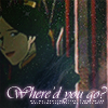 #2 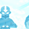 #3 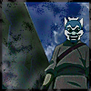 #4 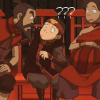 #5 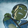 #6 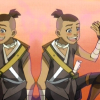 #7  #8  #9  #10 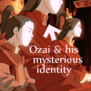 #11  #12 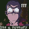 #13 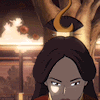  |
|
|
|
Post by nymphadora on Aug 2, 2008 13:01:59 GMT -5
I'm voting for number 2. I like how it's bright and I like the idea of it. It makes me sad to think of how in the first episodes Aang was still a bit of a mystery and now it's all over.  So I liked that. 10 made me laugh though. lol |
|
|
|
Post by darkblood_alchemist on Aug 2, 2008 13:38:10 GMT -5
West, that was just cheap. *ticked because my computer doesn't show moving icons/pics* D<
#8 because of the great coloring and nice crop
|
|
|
|
Post by notreal on Aug 2, 2008 15:17:58 GMT -5
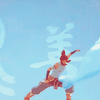
1) Very, VERY nice use of textures. The text color doesn't go with the over all color of the icon, but the font is nice. *Shrug* An alright icon. 2) Hmmm. Nice icon, but nothing amazing. It just seems a little bland to me, however simplicity is not exactly a bad thing. 3) Seems a bit over sharpened and the texture doesn't go. 4) lolwut. XD I like the concept of the icon, but coloring is lacking. 5) Mmmm. Not an easy cap to work with. Texture takes away attention from the icon as well. Also, I seem to miss the over all message the icon depicts. A viewer would never guess that this is supposed to represent a sort of mystery. 6) Not a bad icon, once again, but not great. eh. The coloring isn't great. 7) Lol, nice cap. Needs better coloring. It's what I'd consider an "entertainment" icon, though, for comedic effect. In this case it does nicely. 8) Very, very nice coloring and cap. A+ 9) Aha, nice texture use. I like this icon. It's nice, simple, and catches the eye.  10) Nothing fascinating, but not terrible. 11) Hmmm. The cut is kinda nice, but a soft light effect could help with the ragged edges. 12) The text is hard to read, hun. Try a different font. 13) My first thought was "Wow, this crop is terrible." But then I got the feeling that there was more to be desired...to see some more of her face I suppose? Just like the whole Ursa thing in the show. A lot more to be desired, a mystery. The question mark ruined it for me, though. =/ My pick is number eight. =D |
|
Deleted
Deleted Member
Posts: 0
|
Post by Deleted on Aug 2, 2008 15:39:23 GMT -5
I voted for number one. I liked how it looked sparkly and the text is pretty.
|
|
Aanglover
Avatar Yangchen  The Aang Guru
 This isn't the end, but rather, a new beginning.
Posts: 1,537
|
Post by Aanglover on Aug 3, 2008 5:46:26 GMT -5
hmm.... personally i like 8 or 2 the best...
but i'll pick #8 seeinga s i like the coloring to it.
|
|
|
|
Post by ILZ on Aug 4, 2008 0:00:47 GMT -5
I voted for 9 I really like the coloring on it. I also think Bumi fits the theme well.
|
|
|
|
Post by kyogoon on Aug 4, 2008 6:24:59 GMT -5
I love the coloring of #8.
|
|
Turbo
Toph  omglmao changed his name!
Posts: 164
|
Post by Turbo on Aug 4, 2008 7:51:56 GMT -5
I had to go with #8 as well, it's coloring's really good.
|
|
|
|
Post by tonnie on Aug 5, 2008 10:18:50 GMT -5
I find it hilarious that even though I got the challenge, I forgot to make an entry. My mind is so cunning in the way it works.  I find it even more funny that no on e pulled the "Where do those tatoos end?" mystery, because I was gonna go for that. #1- I knew someone would do the Ursa mystery, because it's the ulimate mystery of this show. I love the texture used, and love the font, and the text. Everything goes well with each other. So far, I'm voting for one. #2- It seems just like a regular crop, nothing special added. The image seems a bit squished even.. I think that a grunge texture and some colirng would have bettered this icon. #3- Erm..the icon seems "oversharpened"... and while I do like the blueness to it all, that filter or texture just doesn't fit well with me. #4- It needs more coloring to me, but other than that, it's an awesome icon! #5- I don't quite understand where the mystery is in this, but I like the textures in it. I just feel like a bit more could've been done with the icon.. #6- Heh, it's funny. Me thinks a nice little lighting texture to spruce it up would've been nice. #7- Heh, I like the face. Coloring or a texture would be nice, but I still like it. #8- Great crop, great mystery. The coloring hurts my eyes a bit, (but my eyes are bad, so what the hey). I can see why everyone would vote for this icon, it's one of the best icons on there, but for the sake of my blindness, I don't think I'll choose it. #9- I like the texture used, it applies a nice softness to the image. pretty good actually. #10- Heh, a mystery indeed, though really, why did they hide his face? It was pointless. I think a texture would have made me choose this icon. If there were more than 20 icons, this one should've won "Best Use of Text." #11- I like the background, and the cutout, but I feel that they just don't mesh together well. ;D #12- The text is kind of hard to read, and I think it could've used some colring or a nice texture. #13- The blinking question mark is a nce touch, but the icon overall isn't anything real special. So I'm voting for 1 it seems. |
|
|
|
Post by Planet Unicorn on Aug 5, 2008 20:20:32 GMT -5
I voted 1. I love the texture, text, and cropping.
|
|
Hana
Avatar Roku 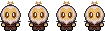 :3
:3
Posts: 1,204
|
Post by Hana on Aug 8, 2008 7:37:48 GMT -5
I voted for #11. Although it to me it didn't quite seem to support the topic, but I preferred the bright colors and nice texture over the others.
|
|
West
Finale Katara
Posts: 8,335
|
Post by West on Aug 8, 2008 21:23:48 GMT -5
Voting closed.
Winners are:
1st: West
2nd: Scarlett Ember
3rd: West
Congrats to everyone!
|
|
 So I liked that.


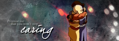


 Sig by BrushBender on ASN!