zukoxme
Agni Kai Aang  Rabid Zuko Fangirl
Posts: 7,769
|
Post by zukoxme on Mar 30, 2007 18:05:16 GMT -5
After many weeks, sorry for the wait!, I've finally gotten enough fair entries! xD |
|
|
|
Post by avatrshay on Mar 30, 2007 19:32:20 GMT -5
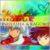
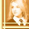
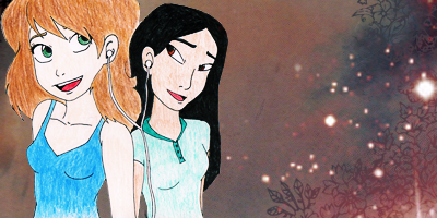
3 is uber pretty ^_^
|
|
|
|
Post by Empy on Mar 30, 2007 21:34:55 GMT -5
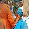
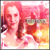
Honestly, these aren't my favorite icons but I think that 2 is rather interesting. The various things going on almost reflect her character.
|
|
|
|
Post by Anonymous on Mar 30, 2007 22:07:41 GMT -5
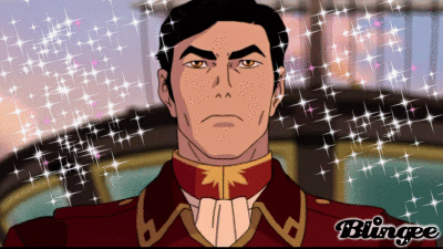
i think #4 is cool  |
|
|
|
Post by catalyst283 on Mar 30, 2007 22:59:32 GMT -5
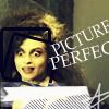
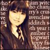
Honestly; I'm not sure why no one's liked #5 for the cool text behind the picture effect. I'm certainly impressed. I mean, 1 and 2 have cool effects and 3 is pretty (though stretched; it looks like  ); the cool text effect on #5 made me vote for it. =D |
|
|
|
Post by Paraiba Ocean on Mar 31, 2007 9:40:20 GMT -5
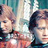
Okay...for my opinion. The bubble on 1 with Harry is just not one I like. But it's still cool. 2 is kinda funny cool. 3's image of Hermoine is too blurry and the text doesn't fit (but I don't know what you mean by stretched, Cat). 4 is okay. I like it. I think 5 is just too busy. With all the text going on in the background, it looks busy. 6 is too bright. I think the text in 7 ruins the entire icon. It should have been left textless. *shrug*
So...now that I've brutally insulted them all (D=) I will vote.
|
|
|
|
Post by Dutchy on Mar 31, 2007 9:41:54 GMT -5
<3 emma watson
I'm going for 3!!!!!!
|
|
|
|
Post by sakuradrops on Mar 31, 2007 9:59:07 GMT -5
I voted for #7
|
|
|
|
Post by KiwiMarine on Mar 31, 2007 11:45:17 GMT -5
I voted #5!
|
|
|
|
Post by catalyst283 on Apr 1, 2007 11:15:28 GMT -5
@para: I think the fact that the image was kind of blurry added to the effects the artist used made it look stretched to me. Now I see it isn't; but it looked like it before. 0_0 (Though that sadly does not change my opinion of it; the texture is a bit too blinding/overpowering for me. :--/)
And don't worry about the critique; I do it all the time when I'm voting for icons. xD
|
|
|
|
Post by Paraiba Ocean on Apr 1, 2007 14:49:15 GMT -5
@cat: Oh...okay, I see now. I agree that the textures are just too much. The maker should have lightened up on them. xD
|
|
zukoxme
Agni Kai Aang
Rabid Zuko Fangirl
Posts: 7,769
|
Post by zukoxme on Apr 2, 2007 19:02:09 GMT -5
(Pssst.. Right click them and go to properties...)
|
|
Astronomy
Avatar Yangchen  Everyone loves a band geek.
Posts: 1,517
|
Post by Astronomy on Apr 9, 2007 16:15:17 GMT -5
Though none are particularly amazing, I voted for 1; I liked the effect.
|
|
|
|
Post by holadraco1234 on Apr 9, 2007 17:42:01 GMT -5
#4
|
|
|
|
Post by avatariaxxxmari on Apr 13, 2007 20:38:35 GMT -5
#3 Its' pretty xD
|
|
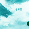
 2.
2. 3.
3.
 5.
5. 6.
6. 7.
7.


 ); the cool text effect on #5 made me vote for it. =D