freakanature06
penguin
Is it weird that I'm in love with a cartoon character?
Posts: 15
|
Post by freakanature06 on Feb 26, 2007 23:15:04 GMT -5
Ok, so I may not be the best at making avatars, signatures, or anything like that, but I'm pretty good, and I'd like some practice. So... If anybody has any simple requests (or even more complicated (except animation-I don't know how to do that)) let me know! I'd love the practice!
|
|
|
|
Post by firebender87 on Feb 27, 2007 12:36:05 GMT -5
I would like to make a simple avatar request, if that's ok with you. Size-100 Text-Fallen from grace Image- caps.airbender.net/img/w12/0368.jpgYou can post it here or send me a PM, whatever's easier for you. Thanks alot. *Karma* |
|
freakanature06
penguin
Is it weird that I'm in love with a cartoon character?
Posts: 15
|
Post by freakanature06 on Feb 27, 2007 14:44:24 GMT -5
Well, I hope this is ok... Thanks for letting me get some practice in! :: hugs ::  |
|
|
|
Post by Paraiba Ocean on Feb 27, 2007 16:13:06 GMT -5
Hey, nature, if I may make some constructive criticism? For the icon, crop more towards a weird angle. Like the way I did:  It just gives it a better presentation. Next, add some textures to the image, rather than brushes. And I do recommend you download some cool brushes from deviantart.com or poke around on livejournal.com. As for the text, it doesn't pop.  Next time, pick a different color and a different font *cough*download at dafont.com*cough* and experiment until you've found something you think fits best. Finally, save your images as .png files. It's less pixely and higher quality. I hope I didn't seem to preachy, btw. >< |
|
freakanature06
penguin
Is it weird that I'm in love with a cartoon character?
Posts: 15
|
Post by freakanature06 on Feb 27, 2007 17:58:50 GMT -5
Oh no! You don't sound preachy at all! I love constructive criticism and things that can help me out! Thanks! ~ME~ EDIT: Here, I tried doing a few of the things you suggested... I wonder, is it any better? :: shrugs :: I'm not sure if I'm the best judge... 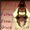 |
|
|
|
Post by Zuko's wife forever on Feb 27, 2007 23:17:01 GMT -5
|
|
|
|
Post by firebender87 on Feb 28, 2007 10:17:34 GMT -5
I received the icon. IT'S GREAT!!!. You couldn't have done a better job.
No offense, but my eyes didn't agree with the first one. So I went with the second one.
If you ever need a favor or something let me know.
Thanks a bunch. XD
|
|
|
|
Post by Paraiba Ocean on Feb 28, 2007 16:26:45 GMT -5
Well, it's certainly better, but no textures. Go to deviantart.com and type in "photoshop textures". Download them. The font still doesn't fit to me. The magenta color is just meh to me. Btw, what program are you using? |
|
|
|
Post by catalyst283 on Feb 28, 2007 22:43:06 GMT -5
Hope I'm not butting in or anything; but my own take [on this] is that what Para is trying to say that the icon just doesn't have...pizazz for lack of better word; it just kind of looks like the screencap cropped with words. And I do agree with Para, the font...just doesn't fit.  That's kind of a thing you figure out with time; I'd also say that you should experiment with coloring and using a different text box for every word so you can edit the brightness of every word as well as their placement.  After doing a simple coloring affect and adding a pretty texture on top plus some text, I got this:  The "from grace" fancy words aren't completely illegible; just readable enough to look cool, especially with the spacing of the "Times New Roman" font from the text ("fallen") above. A slightly brighter text version of that one is this:  |
|
|
|
Post by alpacas4eva on Mar 2, 2007 19:02:31 GMT -5
What program are you using, freakanature? GIMP, Photoshop Elements, Photoshop CS2?
If you tell us that, maybe we can be a little more specific on how to help. ^__^
|
|
Silver-Angel!
Meng  "Time is a great teacher. To bad it kills all of it's students."
Posts: 253
|
Post by Silver-Angel! on Mar 12, 2007 14:37:43 GMT -5
|
|
|
|
Post by Jinfan on Mar 12, 2007 15:25:45 GMT -5
your using MS paint right..?
|
|
Silver-Angel!
Meng
"Time is a great teacher. To bad it kills all of it's students."
Posts: 253
|
Post by Silver-Angel! on Mar 12, 2007 16:12:00 GMT -5
yeah
|
|
|
|
Post by catalyst283 on Mar 12, 2007 16:19:50 GMT -5
For MS Paint, that is very nice.  The darkening of the icon adds to the message, and the way you used the two types of text to emphasize the individual words is very nice. ^^ (Psst, you can get a free 30 day trial of various versions of Photoshop at either download.com or adobe.com or the multiple other websites it'll let you download it on  ) |
|


 Next time, pick a different color and a different font *cough*download at dafont.com*cough* and experiment until you've found something you think fits best.

 made by [pianist] lyrics from My Immortal by evanesence
 That's kind of a thing you figure out with time; I'd also say that you should experiment with coloring and using a different text box for every word so you can edit the brightness of every word as well as their placement.


 The darkening of the icon adds to the message, and the way you used the two types of text to emphasize the individual words is very nice. ^^ (Psst, you can get a free 30 day trial of various versions of Photoshop at either download.com or adobe.com or the multiple other websites it'll let you download it on
  )
)