|
|
Post by Spirit Oasis on May 2, 2006 19:54:55 GMT -5
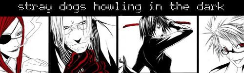
*Why are people STILL giving 10/10s???*
iaramaki (Luna)
avy
color: kinda simple...not much to it really.
cutting: was there any cutting?
text: none
technique: doesn't look like there was much done to it >_<
overall: it's kind of...boring and monotone...try adding something like more colors or textures, or even making it bigger...4/10
siggy
color: again, it's kind of monotone...you need more values and brightness of colors. it's just kind of...flat.
Cutting: it's pretty good, but the girl on the far right is cut kind of badly. the edges need to be cleaned up.
text: it's...ok. not bad, but not great either. Maybe it's the font? or maybe the color? I'm not entirely sure, but it's just not working with the siggy.
technique: the back ground is interesting and it looks like it took awhile, but it doesn't go with the stock at all. the background shouldn't be drawing your eye away from the stock, but in this case, it is.
overall: it's not a bad siggy but it still needs some work. try using more colors to make it pop rather than just blend in, and blending the stock more with the background so it looks more uniformed...6/10
|
|
|
|
Post by almighty on May 3, 2006 1:08:33 GMT -5
I give out 10's because I thought the av/sig was deserving of it. Hehe... I think all the ones that I have rated were by Pera.
I can be a lot harsher though (which I will be from now on I guess), but I just don't want people to take my comments so offensively.
Avatar:
Color: I cannot really give a score for the color scheme. It is exactly the same as the screenshot it is taken from so therefore, all I can say is that the color scheme remains true to the cartoon.
Stock Choice/Cutting: I don't know if it's just me, but there are these random white spots here and there during the animation which is a bit annoying. I'm not sure if it's suppose to be there or not, but it makes the animation a bit awkward.
Text: Well, there's no text on the image itself, but there's the saying "You rise with the moon, I rise with the sun". Erm... well, I'm actually really tired of reading this phrase over and over on every sig/avatar.
Technique: Doesn't really look all too technical to me. When I look at it, it looks like two screenshots that have been tweened to create the "moving heard" effect. Once again, the white spots (whether it's suppose to be there or not) is bothersome.
Quality of Image: quality is okay, but as I've mentioned before the white spots are a set back.
Overall: 7/10 Although I really like the scene and what the Avatar portrays, the image quality isn't really that good and the avatar looks a bit plain. I will give you props on the animation though. It reminds me of the old school games that I use to play. XD
Sig:
Color: Color scheme is good although I have to say that seeing the scene go from blue to red is getting a bit old in my book.
Stock Choice/Cutting: Looks pretty good to me. I think the image may be a little pixelly here and there but it doesn't really stand out or even bother me.
Text: It's a bit hard for me to read the words because it's in a "script" sort-of font and it's a bit small. There also seems to be really tiny words on the sides. I don't know what it says but the black color kind of clashes with the white text. The white text seems to be out of place as well.
Technique: I have to admit, It looks like a screenshot that has been "blended" with the background using (maybe) photoshop's trusty layer blending tool. It looks like you used "luminosity" to me (if you're actually using photoshop). I also see that the other designs are simple brush strokes that may have been added above or beneath the screenshot. Overall, it seems very simple yet satisfying.
Quality of Image: I'm not sure if it's suppose to be pixelly... that may have been a brush effect. Anyway, the image quality looks good.
Overall: 9/10 I really enjoyed looking at how clean the sig looks. It's really simple, but it says so much and it's really moving. On the otherhand, the white text seems out of placed and can be a bit difficult to read. It also really clashes with the black text on the right hand side which makes it look a bit off.
|
|
Psera
Joo Dee  Little Kitty
BOW
Little Kitty
BOW
Posts: 3,178
|
Post by Psera on May 3, 2006 14:57:28 GMT -5
Ah yes, that crazy Pera and her obligation to complete all requests. '-_-
Avatar
color: I always like the achromatic look, but maybe it could use a bit more value changed (by god I sound like my art teacher) 7/10
Cutting: Not bad, just a bit on the small side. I wish I could see more of the picture. 7.5/10
Text: I like your choice of font and it looks better going vertical than it would if it was horizantal. 8.5/10
Technique: The lighting you used in very intriguing, the way that his eyes are a lot darker than the rest is good. 8/10
Image Quality: A bit blurry, and once again on the small side. But the text is clear and sharp so I'll give you a 6.5/10
Overall: You did a very good job with such a small amount of space, and everything seems to fit well. 8/10
Signature (I'll just rate the 'my sacrifice' one, okay?)
Color: I absolutely *love* the way that his eyes pop out at you, and the rest of the base image is pretty much b&w. Making the girl's picture being all color really made it stand out, and has great contrast. 9/10
Cutting: Pretty good, with the first image of the girl dissapearing behind the guy's head, but the scrappy white at the top that overlaps the girl's image bothers me. 7/10
Text: Same as on the av (I'm pretty sure) or at least it matches well enough. It really seems to deliver the guy's personality well and you chose the right words to put into a larger font. 9/10
Technique: I like the background, and the texture to the whole image. The border is interesting too, I never though about using a white and a black border.
Image Quality: Very nice, nothing to complain about here. 9.5/10
Overall: A very nice image to look at, it looks like it was made by someone who knows what they're doing. The small image size actually works for this one, especially compared to some overly-huge ridiculous sigs that other people user. 9/10
|
|
|
|
Post by randomphrase on May 4, 2006 17:24:36 GMT -5
Would anyone like to rate mine??  (I would rate one, but I know I would do a poor job  ) |
|
Psera
Joo Dee
Little Kitty
BOW
Posts: 3,178
|
Post by Psera on May 4, 2006 17:45:18 GMT -5
Uh no, it's kind of a trade. You have to rate someone else's to get rated.
|
|
Copycat
Kyoshi Sokka  <3 Kimi for the Aoi icon
Posts: 3,502
|
Post by Copycat on May 4, 2006 18:48:55 GMT -5
YAY! I get to rate blah's or pera, whoever you are!
Avvie
color: I love the darker coolers. This definately shows that less is more. And the silhouetted character looks very cool
cutting: looks good. everything is balanced and nothing is cut off.
text: very good. the character certainly does look dangerous. the quote underneath goes very well with it too.
technique: Lovely. The way it is slanted gives it a very different but cool effect. and again, the silhouette looks very nice
quality: not blurry at all and the text is easy to read.
overall: i say 9/10 It's unique and different. I just can't tell who the character is. I'm guessing mello though.
Sig:
Color: I love your color bars! The coloring is great, except i don't like the orange color as much. the red, blue and purple are definately my favorite colors on it.
cutting: most of them get his whole face, but i'm pretty sure you ment for the others to cut parts off. it is strange how they're mostly all close ups except for one that is far away though.
text: none
technique: Very original. Like i said before, i love your color bars. the new and improved curved edges are nice too ^_^
quality: Very good. again, not blurry or pixely. i like it
overall: 9/10 it all looks great, except that one orange picture that sticks out too much. other than that it's amazing!
|
|
|
|
Post by randomphrase on May 5, 2006 17:59:39 GMT -5
I suppose I will do my best...
Siggy:
Color:Nice. I enjoy the way the jagged orange background corresponds with the orange hair of the person.
Cutting:The cutting is good. I like the white outlines.
Text: The one word would look better if it were black; that way it could stand out more.
Technique:The technique is cool.
Quality of Image:The image is great. If I had to say anything, the picture of the person on the right is a little fuzzy.
Overall:I think it rocks. Better than anything I can do. I wish I knew who the character was so I could understand it better though. (Sorry if I did a bad job in my critique.)
|
|
|
|
Post by Spirit Oasis on May 5, 2006 22:34:33 GMT -5
Randomphrase
avy -- don't see one xD
siggy -- it's not really a siggy...unless square-ish shaped siggies are the new thing ^_^ regardless there was really nothing done to it. I like the whole negative image idea, but it's not really doing much for this screenshot...it just makes it blue. The fire looks pretty sweet though ^_^ Umm...I guess the color is nice....it's blue and mostly blue. Kind of monotone really. The font is kind of bad...it doesn't really make any sense unless you implying that Aang will be the next Fire Lord (Skill wise that is). The quality of the image is not that great...it looks kind of jagged and a little bit grainy.
|
|
|
|
Post by tornesun on May 6, 2006 8:30:57 GMT -5
I would like an honest rating.
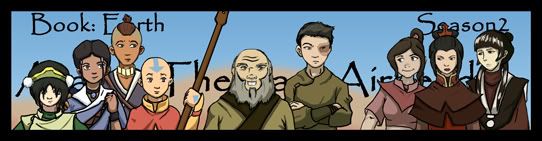
8.5 for yours but that is only because of some of the randomness in your background that I am not partial to. Other than that the concept is nicely centered, with various shades of blue that are pleasing with this new forum coloring. And the art work you chose to go here is quite nice and the background layers play nicely into the coloring of the characters.
Oh yeah, I only give totals scores. I take everthing into consideration when I view a siggy that I like or don't like, hopefully you will be satisfied with only one overall rating, if not? Well I can go back and rate individually.
But as for mine I know I still have some work to do on it, especially with this last episode "Earthbending Tournament" poop. I have to go and remake it. I can already feel my wrist crying! But it will be worth it in the end. Cheers!
|
|
Psera
Joo Dee
Little Kitty
BOW
Posts: 3,178
|
Post by Psera on May 6, 2006 9:10:32 GMT -5
Signature
Color: Simple yet affective, I love the way that most of them don't have faces. I would like it a bit more if Azuka's lightning had a bit more a blue tint, though. I do love the sepia color you used for the outline, though 8/10
Cutting: Very clean, no complaints 10/10
Text: Nice choice of font, but I'm not crazy about the color. It's a bit brighter than the rest of the picture 7/10
Technique: The background is a really interesting symbol, it kind of reminds me of the clash between the two groups. I love the fluid motion throughout the picture and the balance between the two groups, the way that each group has one person in the air to even it up. 10/10
Overall: I love the art (You did it yourself, no?) It all very clean and nice to look at. Nice job, good luck fitting Toph in there. ^.^ 9/10
Avatar
Color: Same as the sig. 8/10
Cutting: Nice, but I feel kinda like you cropped it to the wrong spot on Azula. It seems like you cu off her fett and left a big space above her head. Also, it's quite pixely. 5/10
Text: None
Technique: Just seems like a crop of the sig 6/10
Overall: Kind of repetitive, we just saw the same picture in the sig, only not all pixely. 6/10
Oh, and before anyone asks, the people in my sig are Near (left) and Mello (right), from Death Note. XP
|
|
|
|
Post by tornesun on May 6, 2006 10:19:58 GMT -5
Thanks and I have updated, I had to take the avatar back to Aang in free fall, but other than that? Well hopefully the sparkle on the fire will please you more. As hopefully will the less dark title. And with my work, for some reason it is hard to get the avatar bit of it not to look so pixally... guess I have to go back to using screen shots. And thanks for noticing that I didn't just use black for the outline. Not many people really notice that. And for most of the characters not having faces... well I was having a time trying to get the same big eyed look that the series has... it's difficult when I am use to working with less anime type of art. So I was just plain lazy! haha! oh well. And... any ideas on how to shift the picture to include Toph? The series was already heavy on the good characters, now it is even more so. I almost wish there were more undecideds or more villains (of the kids age) for balance but so far all I have is this: www.deviantart.com/deviation/32506965/ and yes this is the original one I did but I kept getting to the same spot and hitting a brick wall... now I have Toph to add.... crumbs. And as always I like your clean style. and how you have adapted the colors to suit you. Have you ever made any of your own type faces? 9.75 overall but this is simply because I haven't watched the show your are referencing. (so it is viewer error and not siggy and avatar maker error) |
|
Akash
FN Aang 
Posts: 1,857
|
Post by Akash on May 6, 2006 11:09:23 GMT -5
Avvie-
Color: 10/10 I don't see anything wrong with it o.0
Stock Choice/Cutting: 10/10 Nothing wrong here...
Text: none.... so 10/10
Technique: 10/10 ^^
Quality of Image: 9/10 I bit fuzzy...
Overall: 10/10! Nice job! I really like it.
Siggy-
Color: 10/10 Nothing wrong here
Stock Choice/Cutting: 10/10 AMAZING
Text: 10/10 Very blendy!
Technique: 10/10 *high-five*
Quality of Image: 10/10 Perfect
Overall: 10/10 Nice job!!
|
|
Zink
Ty Lee 
 "Whoever does not love does not know God, because God is love." 1 John 4:8
Posts: 4,279
|
Post by Zink on May 9, 2006 18:15:24 GMT -5
Toph Avvie:
Color- 10/10. I love the gray/black-n-white. Gray fits in with that picture because Toph look at peace.
Stock Choice/Cutting- 10/10. I like cool white border and the swirly-swirls.
Text- 9/10, just because there isn't much text, but nice effect on the letters.
Technique- 10/10. Duh.
Quality- 10/10. Looks fine to me.
Overall- 10/10. Obviously, the layout admin made it.
Wicked Avvie: Overall- very nice, good through simplicity.
Toph Sig:
Cutting- 11/10 Beeeeuatiful.
Text-8/10- It looks really nice, but I don't really get it.
Quality- 9/10 it looks a little blurry on Toph's chin.
Technique- 10/10. Exellecent.
Overall- Lovely. 10/10
Wicked Sig;
Text- I really like the font and the... shine? effect. Also, the Defying Gravity font matched the song, which is COOL!
Cutting- 11/10. Oh, my gosh. It's GOOD. I love the clarity of it.
Quality- 9/10 The way the light is hitting Elphaba looks kinda funny to me.
Technique- 10/10. So wonderful...
Overall- Beautiful. Just beautiful.
Now people, please don't judge me too harshly. I made my sig and avatar in PAINT. How lame is that?
|
|
|
|
Post by Spirit Oasis on May 11, 2006 20:37:45 GMT -5
mutant goldfish avy -- there's really nothing to say about it. Sorry, but it's just a picture that's been cropped...there are no brushes or textures, or even text for that matter. Try at least adding a more interesting background rather than white...2/10 siggy -- LOVE THIS PICTURE OF TOPH. The text isn't bad, but it's not great either. Again you've only cropped it and you can still see the "Avatar Spirit.com" thing in the corner along with the "NICK" logo...that's kind of sloppy looking and implies that you didn't take a lot of time when you made this. I like the text though...it's interesting, deep and true. Since you have Paint, try getting rid of the unwanted things at the lower left and right hand corner but the quality of the picture is great ^_^...4/10 Ooh, god I just judged you really harshly...I'm sorry  please don't kill me >_< *hides in corner* Why don't you download a free trial of Photoshop? that's what I did, and it makes WONDERFUL siggies and icons ^_^ |
|
Siani
Katara  yes....my icon is awesome....
Posts: 85
|
Post by Siani on May 11, 2006 22:59:21 GMT -5
Avatar: Color: Same colors of the screenshot plus the green and gray colors Stock Choice/Cutting: not much cutting Text: none Technique: Very simple but if Toph's mouth was close it would have been more effective. But I see that her quote is there so that ok. The shot of her is flipped and placed more toward the lower right corner. The designs are taking up most of the avatar. I see the thin border used also. I think it took a while to put everything together. Quality of Image: I would rate it 10/10 very nice... Overall: I would give it a 10 just because I think it's cool design and it's Toph. Simple but says so much. Sig: Color: Blues and skin colors of Katar and Zuko Stock Choice/Cutting: I'm guessing that the background was cut out so you could add the background or colored blue. Text: Break the Silence (couldn't really read it though) Technique: Lots of stuff in the background and the same designs used from the avatar also. There's a glow on Katara. I'm curious on where it's coming from. Quality of Image: 10/10 I love great quality ^_^ Overall: Break the silence is something that Katara is really doing lol I give it a 10 also.  |
|

 )
) 


 please don't kill me >_< *hides in corner* Why don't you download a free trial of Photoshop? that's what I did, and it makes WONDERFUL siggies and icons ^_^