Deleted
Deleted Member
Posts: 0
|
Post by Deleted on Sept 6, 2008 18:04:24 GMT -5
I've never seen the show, but the icons are really nice.  |
|
|
|
Post by Kohana on Sept 6, 2008 18:11:06 GMT -5
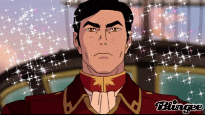
I've never seen the show, but the icons are really nice. Thanks. =D Ooh Ooh Ooh these are lovely! I love them all  Now we can TOTALLY fangirl Princess Tutu, together <3333 EmpyxFakirxKohana Anyone?Thanks. <3 Yes, we can. I even want to re-watch the show again.Fampyhana do want. |
|
|
|
Post by Empy on Sept 6, 2008 18:15:44 GMT -5
Actually, I do have a favorite xDD  But yeah, I should rewatch the show again. I haven't seen the series in so long ;_; I used to be so obsessed with it. If Fakir was a real guy I'd ttly marry him xD But yes, Fakempyhana is most awesome win!!! |
|
|
|
Post by Kohana on Sept 6, 2008 18:21:48 GMT -5
That's actually my favourite as well. It's because that screenshot is just so beautiful.
I'm obsessed with it at the moment. Especially with FakirxAhiru, it's one of my ultimate OTPs of all fandoms.
Same. xD I kept thinking from episode one that he's much more interesting than Mytho and then later on that Ahiru should realise her feelings for him. It certainly is!
|
|
Ana
Metalbending Cop 
Posts: 5,061
|
Post by Ana on Sept 6, 2008 22:45:45 GMT -5
Princess Tutu icons! <3 They're great, Kohana. My favorite is the one Empy reposted. Also, I just re-watched a Fakir centric episode today. And, man, I forgot how much I love him. He's got that intresting knight vs. writer thing going and him and Ahiru are great together. They bicker and depend on eac other. He's a lot better than Mytho who is only really intresting because of his roles with other people. Rue, then, may not have the best taste but I love her lots too. |
|
|
|
Post by Empy on Sept 7, 2008 8:03:44 GMT -5
Lol, 3/4 of the Awesome Foursome likes Princess Tutu <333 I say we all have a PT theme sometime  Anywho, I agree about your assessment about Fakir. He's SO much more interesting than Mytho though I suppose one might argue that Mytho's lame because he has no heart or only parts of it for the majority of the series. Anywho, Fakir was a much more engaging protagonist and him and Ahiru are adorable together. I loved Ahiru I say if anyone watches the series, watch the Japanese version because I know Ahiru translates to Duck in Japanese but it's just weird to hear a girl be called "Duck" in English >.< she was so cute and courageous, she was a really sweet protagonist. I also liked Rue, although I know you don't care for her so much, Sofie. I thought she was cool although her taste in men OBVIOUSLY isn't as good as Ahiru's |
|
|
|
Post by Kohana on Oct 14, 2008 5:56:43 GMT -5
|
|
|
|
Post by night on Oct 14, 2008 13:59:17 GMT -5
OHGOD THE MIN ONES. So sexy. Especially the first one. :'D
|
|
|
|
Post by Kohana on Oct 16, 2008 13:32:48 GMT -5
Thanks, night. <3 Well... it's really Min who makes it sexy. |
|
Liamane
Aang  Alas, the bliss of childhood...
Posts: 64
|
Post by Liamane on Oct 30, 2008 20:06:03 GMT -5
The Cowboy Bebop icons are awesome. The second Fuu icon's my personal favorite. :3 Good work!
|
|
Beebs
Aang
And God does give you AIDS, btw...
Posts: 59
|
Post by Beebs on Oct 30, 2008 22:27:30 GMT -5
Oooh, wow, that Faye one is sublime! Most of these are nice, but the main thing that I notice is the way the text sticks out a bit much. (Faceplam, in particular) So, I'd say look up some techniques on getting text to fit in more, tut or otherwise, or leave out text altogether. If you do the latter, however, make sure the icon has enough work put into it to be able to stand on its own. Nice subtle use of textures in most of these. The only other thing that comes to mind is try to make the colors pop a bit more, by whatever means, so that they don't look too much like bases. xDD Nice job, all in all. |
|
|
|
Post by notreal on Oct 31, 2008 10:05:38 GMT -5
I agree with BBV. The white text pops out way too much and completely shatters the icon. BUT DON'T TAKE IT OUT, SOFIE....then it'll just be a base, and damnit, that is a beatable offense. :]
|
|
|
|
Post by Paraiba Ocean on Oct 31, 2008 16:13:14 GMT -5
The Yunho one has awesome coloring at the risk of sounding like a biased fangirl. The second Changmin icon could use a little less of the tiny text. It's a giant wall behind him, but other than that, osm job.  The facepalm icon didn't need the text in that case, a textless icon would have been A-okay. : D |
|
|
|
Post by Kohana on Nov 1, 2008 9:07:43 GMT -5
@liamane: Thank you. @bb Valentine: Thanks for the tips. I'll try to make the colours pop out more next time. @shay: Lolllll. @para: I'm glad you love the Yunho one. ♥ And thanks for the tips, hon. |
|
|
|
Post by Kohana on Nov 12, 2008 9:43:56 GMT -5
|
|


 Now we can TOTALLY fangirl Princess Tutu, together <3333


 |.
|.