West
Finale Katara 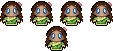
Posts: 8,335
|
Post by West on Dec 23, 2008 14:57:11 GMT -5
Haha, thanks! There are going to be a lot more FFXII ones coming, so be prepared!
Do you think I should/shouldn't add something to the icons? Any colorings I should try, etc?
|
|
|
|
Post by Musogato on Dec 25, 2008 4:24:47 GMT -5
Nice icons! I especially like this one: 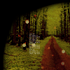 So pretty! ^^ |
|
|
|
Post by sokkafan100 on Mar 7, 2009 23:30:14 GMT -5
Awesome Avatars. I enjoyed this one.  And I think I know which site you used for the screenshots. |
|
West
Finale Katara
Posts: 8,335
|
Post by West on Mar 9, 2009 15:56:14 GMT -5
|
|
|
|
Post by syarafire on Mar 9, 2009 20:29:16 GMT -5
Oh, wow, so pretty. =) I especially like 9 and 10 for the icons, and 18, 21 and 26 are really great. I love the new stuff. ♥
|
|
|
|
Post by beautyfr.pain on Mar 10, 2009 18:49:52 GMT -5
Oh I love 2, 9, 13, 26, and 28. Keep up the good work :3
|
|
West
Finale Katara
Posts: 8,335
|
Post by West on May 17, 2011 20:51:22 GMT -5
I'm finally making my return with graphics! I remembered that I had this thread from long ago, and you guys were good at giving me criticism so I'm back again! I decided I'm going to start by making three icons from every episode of Avatar. My first dump I have is from the first 10 episodes, and they are just some things I came up with today in my spare time. Let me know what you think! |
|
|
|
Post by Musogato on May 18, 2011 3:42:36 GMT -5
Ah, that sounds like a fun challenge, and I like these new icons! I like the textures you used in 1-c, 4-a, and 6-b, and love the cropping/positioning in a lot of these, but especially 1-b & c, all of 2, 3, and 4, and 9-a. Overall pretty nice, and welcome back to graphic-making!  |
|
|
|
Post by Blind Bandit on May 18, 2011 16:02:18 GMT -5
Good to see getting back in the graphics swing west! Nice work.
|
|
West
Finale Katara
Posts: 8,335
|
Post by West on May 24, 2011 12:25:52 GMT -5
Thanks Muso and Blind Bandit!
Feel free to criticize them too so I can make the next batch better!
|
|
|
|
Post by Musogato on May 26, 2011 13:51:39 GMT -5
Okay, well... my crit would be for 5-b. If I didn't remember that episode, I wouldn't know what was going on. I know the camera shot is pulled back so we can see the whole action, but that also makes Bumi and Aang very tiny and hard to see. I do like the cropping placement with the arches on top, and the general color scheme, but for faraway shots like that, I would suggest doing something to better define the characters so they don't blend into the background as much. One way would be to create a new Soft Light layer and paint black over the characters to darken their shadows, and then adjust the layer opacity so they're visible but not sticking out like a sore thumb. Hope that helps. ^^;
|
|
|
|
Post by Kohana on May 26, 2011 18:05:43 GMT -5
I like your scenery icons the most, West. Like 3-a and 9-c. I also adore the bottom Sokka one. It's a great crop, great colouring and I like the placement of the tiny text.
Some icons, however, feel a bit off to me. They have the potential to be great, though.
First texture use. For example 2-c. It's a good crop of Appa but it'd be better without the texture. When using a texture like that your subject should be in the centre because the texture focuses on it. It also feels a bit too washed out. Maybe copy the base and change it to soft layer? Other than that it's a good icon. The texture use on 6-c seems weird too. A grunge texture is good on it, yes, but not really when it cuts a character. Again, other than that everything is ok. Your light textures are well-used. I like the placement and you use them well so that they add an extra spark to the icon.
Then the colouring. Is it possible that I detect Gabi's colouring used on icons containing characters? She explicitly stated that that colouring should not be used on animated characters because then they look too satured and red/orange, and I do find some of your icons to be so. Maybe it's better to tweak it sometimes and lower the opacity of some layers to 10%. A tutorial is always meant to be a guide and not have every step to be followed exactly. Not all caps can be used in the same fashion.
Crop-wise I have no critique whatsoever. There is bold variation, because there are some who always have the same type of crop and that isn't the case here, so that's definitely a positive thing. I really like the cropping of the Sokka icons.
tl;dr (sorry about that) but I hope this was helpful. :3
|
|
SD
Momo 
Posts: 30 
|
Post by SD on Jun 8, 2011 17:46:27 GMT -5
;D  ;D ;D  loving them -- Hi, welcome to the forum! However, please don't quote the giant icon posts, and in the future please add more to your comments. Thank you.  -Musogato -Musogato |
|
West
Finale Katara
Posts: 8,335
|
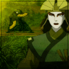
Post by West on May 11, 2012 21:50:09 GMT -5
I'm coming back with brand new icons for the premiere of Korra! I'm going to try and do a dump for each of the episodes! Here are some previews from the first dump from the first episode: 1)  2)  3) 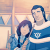 4) 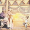 5) 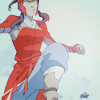 6)  7)  8)  9) 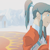 10) 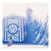 |
|


 ;D
;D 
