Zink
Ty Lee 
 "Whoever does not love does not know God, because God is love." 1 John 4:8
Posts: 4,279
|
Post by Zink on Jul 5, 2008 23:07:25 GMT -5
^ *stabbity-stab* Nah, I've seen worse. I is loved! Yay! Those are gorgeous, TM. I especially like the lower middle one, though the general consensus that simpler is better is probably true. @tm -- Your's are really good too. Some of them are a bit busy for my tastes, but I can't believe you were that good when you first started. Sadly, I'm not that good now.  Oh my Jedi. I'm in love with Deke McClelland.  I haven't been making a lot of icons lately (I've been coloring lineart, though), but I've made a few since I went AWOL from DH.       ![]() img228.imageshack.us/img228/5706/pantsgn9.jpg[/img img228.imageshack.us/img228/5706/pantsgn9.jpg[/img  I <3 Death Note. |
|
|
|
Post by darkblood_alchemist on Jul 6, 2008 13:14:12 GMT -5
EEEEEEEEEEEEDDDDDDDDDDDD!!!!!!!!!!!
*cough* Erm...right.
Death Note is awesome and L's face is the 4th icon is just "wtf?" great. The "spoilers" and pants ones made me laugh and the image in the "imagine" one is really pretty. What is it a pic of anyway?
|
|
Zink
Ty Lee
"Whoever does not love does not know God, because God is love." 1 John 4:8
Posts: 4,279
|
Post by Zink on Jul 7, 2008 21:34:54 GMT -5
^ Thanks, guys!
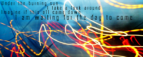
The image from the 'imagine' one is a picture my parents took in a Las Vegas casino. Go figure. Apperently, there was a big glass wall with glass flowers set in it.
The sad thing is that "pants are not optional" is a real quote. My band director is a strange man.
Yeeees. Eeeedddd.
|
|
West
Finale Katara 
Posts: 8,335
|
Post by West on Aug 4, 2008 14:00:00 GMT -5
*Super Bump!* So I need some opinions on this if you all don't mind. Yesterday I filled Chibi's request for a David Archuleta icon. This is what I got for the coloring part:  But then she wanted text on it (David Arculeta fangirl) on it, and i was stuck. This was the final though:  But I don't really like the text there/with that color. So could you all give me some ideas of what colors/placement/effects I should have done with the text for this icon. Thanks! |
|
|
|
Post by night on Aug 4, 2008 14:33:01 GMT -5
Honestly, I would just leave the text out. It takes away from the coloring and crop.
|
|
West
Finale Katara
Posts: 8,335
|
Post by West on Aug 4, 2008 15:01:05 GMT -5
Well, that's what I would have done, but she wanted text, so I sort of had to put it on it.
|
|
|
|
Post by night on Aug 4, 2008 15:06:09 GMT -5
Well, that's what I would have done, but she wanted text, so I sort of had to put it on it. Thats one of the annoying factors of doing requests. xD |
|
West
Finale Katara
Posts: 8,335
|
Post by West on Aug 4, 2008 15:09:33 GMT -5
But other than that, I actually really liked how the icon came out. It was my first time using that sky texture! xD
|
|
|
|
Post by night on Aug 4, 2008 15:11:27 GMT -5
But other than that, I actually really liked how the icon came out. It was my first time using that sky texture! xD It is really good. =D I especially love the crop. |
|
|
|
Post by darkblood_alchemist on Aug 4, 2008 17:21:19 GMT -5
Try rotating the text so that it fits along the left side (where the texture is), changing the layer type to overlay or something of the sort, and changing "David Archi-whatever" to an all caps font with "fangirl" still lowercase and smaller. I would leave it white though (maybe change the opacity a bit) and use a shadow or something to make it stand out.
The icon base is really pretty though, and like Night said if it wasn't a request I would leave it alone.
|
|
|
|
Post by Chibi Chan-o on Aug 4, 2008 21:06:01 GMT -5
Well, that's what I would have done, but she wanted text, so I sort of had to put it on it. Thats one of the annoying factors of doing requests. xD Hey, don't be dissing my request. XD I think it looks fine with and without text, but the textless version does look better.... Maybe I'll switch my icon for the textless one. >.< |
|
|
|
Post by night on Aug 4, 2008 21:09:15 GMT -5
Thats one of the annoying factors of doing requests. xD Lulz. I just meant doing something to an icon/sig when you know it would look better otherwise. |
|
West
Finale Katara
Posts: 8,335
|
Post by West on Aug 5, 2008 10:54:53 GMT -5
Try rotating the text so that it fits along the left side (where the texture is), changing the layer type to overlay or something of the sort, and changing "David Archi-whatever" to an all caps font with "fangirl" still lowercase and smaller. I would leave it white though (maybe change the opacity a bit) and use a shadow or something to make it stand out. The icon base is really pretty though, and like Night said if it wasn't a request I would leave it alone. Ooow, I like that idea alot. I can see how that would look. Thanks, I'll keep that in mind for other icons! |
|
|
|
Post by kyogoon on Aug 6, 2008 17:49:37 GMT -5
@west: Hmm, I don't see a way you could have made the icon look better with text, unless you made the person's face a bit smaller? But I still like the result. ^^ I just got PS a few weeks ago and I've been playing around with it a lot. Now I tried for the first time to make a sig with blending, and this is what I got. Some constructive criticism?  Btw, anyone know where I can get some good large textures? |
|
|
|
Post by syarafire on Aug 6, 2008 18:53:07 GMT -5
Wow, that's really, really good, especially for your first blending sig. I can't spot anything I'd consider less than absolutely perfect except for some stuff that's just personal preference. I ♥ it. And I'm totally jealous.Could anyone give me constructive criticism on the two icon dumps I have here? I personally kind of like my new style for once, but I want to get better. xD EDIT: Absentminded Syara is absentminded. I find most of my large textures through DeviantArt (just do a search for 'large textures', a lot of texture packs should pop up), icon_textures (surprisingly, there are a lot of large texture sets there), and texturize. =) |
|