
Post by Irko Leader Endless on Sept 21, 2007 18:05:44 GMT -5
Well, lately I've been pretty much addicted to getting my graphics looking shiny and purdy, so this tutorial follows a very in depth explantion of how I create of some of practice avatars. ;D
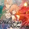
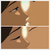
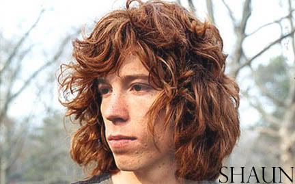
We'll be going from this:
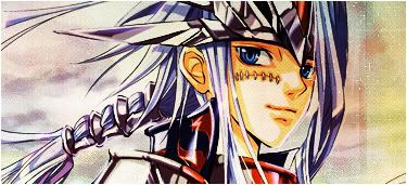
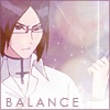
To this:
Warning! Image Heavy!
1. Touchups: I'm going to cheat my way for the base, cropping has never been one of my strong points, so I snag one of the beautiful bases from Iroh.org.
Since half of the base is already compleated, I can skip down to making it more purdy.
This is where the fun starts. Duplicate your base once, and go up to the Adjustments tab in the Image drop down bar. Set the base on Auto Levels, and leave it on 100%. Either merge your level layer, or just duplicate it and continue to Auto Color, drop down the Opactiy to a small number, 25% is a good place. Duplicate, and open your Color Balance window. For this avatar, I used a lot of Red and Blue, and just a hint of Green. The settings would vary, but they would end up somewhat like this.
Red: +30
Green: +10
Blue: +40
(Add more Red if needed)
This is optional, but I also went into the Match Color window and brought the Color Intensity tab to the right, so that the coloring looks more crisp.
Your base should now look like this:
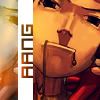
2.Textures: Next, take this pretty orange texture, and put it above the base layer at Screen-37%.
 =
= 
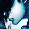
Now, take this landscape texture, and place it at Soft Light-80%.
 =
= 
This gradient comes next, and I place it at Screen-37%.
 =
= 
Now, now this Avatar looks way too bright for my tasts at the moment, so I grab a dark texture, and pase it over at Soft Light-18%
 =
= 
This can be another optional setting, but I add this orange gradient at Soft Light-9% to give the avatar a small orange glow. You can making it harder, or lighter if desidered.
 =
= 
Now, light textures are slowly becoming my favorites to use in Avatars. So I take this pretty one and set it to Screen-63%.
 =
= 
Finally, I add a single mask texture to the Avatar, flip it and put it Screen-75%. I also delete the stuff that looks too crowded.
Your icon should now look like this:
 =
= 
3. Brushes/Text/Misc: Pretty isn't it? Okay, create a new layer, and add a few stary brushes over Zuko's back, and other places where it looks a little dull. Placing the layer's opactiy somewere between 70% and 55%

Now, it's time to add the text to the avatar, spacing the text once pure letter. (Ex: L O N E W A R R I O R) Also place some small letter brushes underneath the text if needed.

The last step is just a personal touch of mine, create a new layer by going to the Layer tab and clicking new, (Ctrl+Shift+N) and set the new layer to Lighten. Your layer is now filled with black, go to your Layer Style window, and place a white stroke around the avatar, the settings should be placed as such:
Size: 1 px
Position: Center
Don't mess with anything else in the window unless you feel the need to.
And there you go! Your avatar is compleated, and looking mighty pretty!
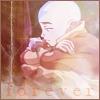
Final Project:
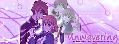
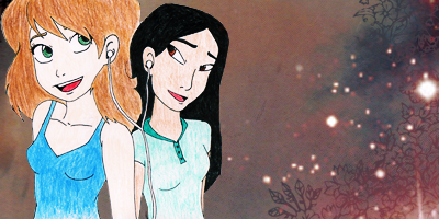
Other projects using the same settings:
(The only differentices are some mask brushes, and a picture texture at the bottom)
I hope this has been helpful for everyone~!!!![/i]
We'll be going from this:
To this:
Warning! Image Heavy!
1. Touchups: I'm going to cheat my way for the base, cropping has never been one of my strong points, so I snag one of the beautiful bases from Iroh.org.
Since half of the base is already compleated, I can skip down to making it more purdy.
This is where the fun starts. Duplicate your base once, and go up to the Adjustments tab in the Image drop down bar. Set the base on Auto Levels, and leave it on 100%. Either merge your level layer, or just duplicate it and continue to Auto Color, drop down the Opactiy to a small number, 25% is a good place. Duplicate, and open your Color Balance window. For this avatar, I used a lot of Red and Blue, and just a hint of Green. The settings would vary, but they would end up somewhat like this.
Red: +30
Green: +10
Blue: +40
(Add more Red if needed)
This is optional, but I also went into the Match Color window and brought the Color Intensity tab to the right, so that the coloring looks more crisp.
Your base should now look like this:
2.Textures: Next, take this pretty orange texture, and put it above the base layer at Screen-37%.
= Now, take this landscape texture, and place it at Soft Light-80%.
= This gradient comes next, and I place it at Screen-37%.
= Now, now this Avatar looks way too bright for my tasts at the moment, so I grab a dark texture, and pase it over at Soft Light-18%
= This can be another optional setting, but I add this orange gradient at Soft Light-9% to give the avatar a small orange glow. You can making it harder, or lighter if desidered.
= Now, light textures are slowly becoming my favorites to use in Avatars. So I take this pretty one and set it to Screen-63%.
= Finally, I add a single mask texture to the Avatar, flip it and put it Screen-75%. I also delete the stuff that looks too crowded.
Your icon should now look like this:
= 3. Brushes/Text/Misc: Pretty isn't it? Okay, create a new layer, and add a few stary brushes over Zuko's back, and other places where it looks a little dull. Placing the layer's opactiy somewere between 70% and 55%
Now, it's time to add the text to the avatar, spacing the text once pure letter. (Ex: L O N E W A R R I O R) Also place some small letter brushes underneath the text if needed.
The last step is just a personal touch of mine, create a new layer by going to the Layer tab and clicking new, (Ctrl+Shift+N) and set the new layer to Lighten. Your layer is now filled with black, go to your Layer Style window, and place a white stroke around the avatar, the settings should be placed as such:
Size: 1 px
Position: Center
Don't mess with anything else in the window unless you feel the need to.
And there you go! Your avatar is compleated, and looking mighty pretty!
Final Project:
Other projects using the same settings:
(The only differentices are some mask brushes, and a picture texture at the bottom)
I hope this has been helpful for everyone~!!!![/i]


 |.
|.