Post by gambitia on Jul 18, 2006 0:45:25 GMT -5
This is a simple beginner's guide to making icons. It covers all the basics of cropping, resizing, fixing up a base, and layer modes.
For making icons I use GIMP ver. 2.2, which is available for free here. If you want to get into icons but don't have the money for expensive programs like Paintshop or Photoshop, GIMP is a good alternative. GIMP is basically the same as Photoshop; the only differences lie in filters, a few layer modes, and the names of the tools. It's totally free of viruses, I swear, so it's safe to use.
For this tutorial, you will need a program such as Photoshop, Paintshop, or GIMP. Microsoft Paint isn't going to cut it.
Now, let's begin!
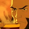
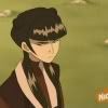
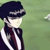
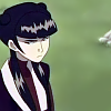
The first order of business is choosing a screencap to use. There's a good selection over at firebender.com or avatarspirit.com. Find one you like and open it in your program. I'll be using a cap of Mai:
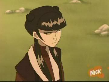
Some tips for choosing screencaps: the higher quality, the better. Notice that my cap of Mai isn't grainy, and it is neither very dark nor very washed-out. The lines are all clean and that pesky Nickolodeon logo is off to the side and not covering up Mai. It also has a nice amount of blank space, which makes it easier to find a good crop. Bigger screencaps are almost always better; this cap of Mai was about 700 pixels wide (I downsized it so it wouldn't stretch the page). Screencaps that are smaller than 200-300 pixels are generally too small to use: once they're that small a lot of the detail has been lost.
Now we need to crop the picture. Icons are almost always squares, so we're going to need to select a square.
Select your Rectagular Marquee tool. It looks like this: . Hold down the Shift key and then click and drag your mouse across a section of your picture. Because you're holding down Shift, the Rectangular Marquee tool will be a perfect square. Select a portion of your icon. When you let go of your mouse you should have some nice dancing lines. Go to Image<Crop Image. Now you should have a nice little square.
Here's a quick guide on what makes a good crop:
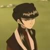
This isn't a very good crop. It's pretty boring; there's nothing particularly special or intriguing about it. Also notice how Mai looks off-center. She will look off-center no matter what you do; you can take out a ruler and measure and she'll still look off-center. It's generally better not to center the subject of your icon; having them off to one side works better.
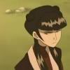
These crops are alright. They're more interesting than the first one, but there's something about it them seems a little off to me. They'd probably make pretty good icons, but I think I can find a better crop.
This one I like. Cropping is partly a matter of personal taste, and you'll have to practice to find crops you like. After you do it for a while it'll become pretty easy to see what crops will work well and which won't. Play around for a while until you get something interesting.
Now it's time to resize your icon. Icon sizes varies from site to site, but 100 pixels max is the standard on this site and is a very common size. To resize your icon, go Image<Scale Image. You should get a screen that looks like this:
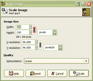
The only things you need to worry about here are the Width and Height boxes. For Width, enter 100. By default the width and height are locked in proportion with each other; click the knot circled in red to toggle that on and off. You want that on; it prevents the picture from warping. It also will automatically set the Height to 100 once you enter the Width as 100. Once you've entered the sizes, click Scale.
Now you have the standard 100x100 icon base. It's time to fix it up.
First off, go to Layers<Colors<Levels. It will open a rather scary-looking screen:
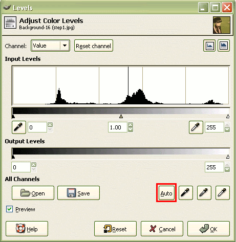
Fortunately, the only thing you need to worry about here is the Auto button I circled in red. Hit Auto; don't play with the other settings unless you really know what you're doing. Once you've hit Auto, look at your icon. 9 times out of 10 the Auto button makes icons look a lot better, however sometimes it gives you weird effects. Click Okay if you like what you see.
I got that after using the Auto button. The colors are brighter, the yellow cast is gone, and the contrast is up.
You might still have that pesky Nick logo on your icon; if so this is the time to get rid of it. Select your eyedropper tool. It looks like this: . Use it to select a color near the Nick logo. The color should now be your foreground color. Select your paintbrush tool and carefully paint over the Nick logo.
If you look down in the bottom right corner of my base you can see the blob of color where the logo was. Select your blur tool--it looks like a teardrop--and blur over the blob so it blends in.
Now we need to sharpen our icon. Go to Filters<Enhance<Sharpen. You'll get this window:
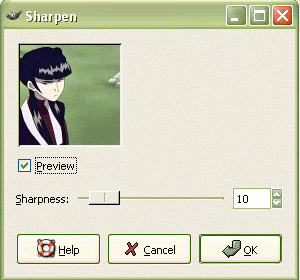
The little slider controls sharpness: the farther right it is the sharper the image. There's also a handy preview window so you can see the effects. I've generally found that icons look best when the slider is set at 20-30, although for some icons I've gone as high as 70 and some don't need sharpening at all. Play around for a bit; you want your icon to be sharp, but you don't want this to happen:
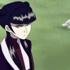
That just looks bad. It's better to go too low with sharpening than too high. I played around with my base and got this:

The change is slight, but the lines are now more defined.
Now, if you zoom in on your icon you may notice that it's grainy. It's time to take out the blur tool again. Select the blur tool and start carefully going over your picture wherever you see grain. Don't go over lines, and be especially careful around the hair and face. You'll probably have to zoom in to do this; I generally zoom in 800%. You may also have to switch to a smaller brush. Zoom out once you're done:
Your base is now ready for use! Feel free to ask if you need something explained in more detail.
Coming soon: Layer modes and some tricks to get cool colorings.
For making icons I use GIMP ver. 2.2, which is available for free here. If you want to get into icons but don't have the money for expensive programs like Paintshop or Photoshop, GIMP is a good alternative. GIMP is basically the same as Photoshop; the only differences lie in filters, a few layer modes, and the names of the tools. It's totally free of viruses, I swear, so it's safe to use.
For this tutorial, you will need a program such as Photoshop, Paintshop, or GIMP. Microsoft Paint isn't going to cut it.
Now, let's begin!
The first order of business is choosing a screencap to use. There's a good selection over at firebender.com or avatarspirit.com. Find one you like and open it in your program. I'll be using a cap of Mai:
Some tips for choosing screencaps: the higher quality, the better. Notice that my cap of Mai isn't grainy, and it is neither very dark nor very washed-out. The lines are all clean and that pesky Nickolodeon logo is off to the side and not covering up Mai. It also has a nice amount of blank space, which makes it easier to find a good crop. Bigger screencaps are almost always better; this cap of Mai was about 700 pixels wide (I downsized it so it wouldn't stretch the page). Screencaps that are smaller than 200-300 pixels are generally too small to use: once they're that small a lot of the detail has been lost.
Now we need to crop the picture. Icons are almost always squares, so we're going to need to select a square.
Select your Rectagular Marquee tool. It looks like this:
. Hold down the Shift key and then click and drag your mouse across a section of your picture. Because you're holding down Shift, the Rectangular Marquee tool will be a perfect square. Select a portion of your icon. When you let go of your mouse you should have some nice dancing lines. Go to Image<Crop Image. Now you should have a nice little square.Here's a quick guide on what makes a good crop:
This isn't a very good crop. It's pretty boring; there's nothing particularly special or intriguing about it. Also notice how Mai looks off-center. She will look off-center no matter what you do; you can take out a ruler and measure and she'll still look off-center. It's generally better not to center the subject of your icon; having them off to one side works better.
These crops are alright. They're more interesting than the first one, but there's something about it them seems a little off to me. They'd probably make pretty good icons, but I think I can find a better crop.
This one I like. Cropping is partly a matter of personal taste, and you'll have to practice to find crops you like. After you do it for a while it'll become pretty easy to see what crops will work well and which won't. Play around for a while until you get something interesting.
Now it's time to resize your icon. Icon sizes varies from site to site, but 100 pixels max is the standard on this site and is a very common size. To resize your icon, go Image<Scale Image. You should get a screen that looks like this:
The only things you need to worry about here are the Width and Height boxes. For Width, enter 100. By default the width and height are locked in proportion with each other; click the knot circled in red to toggle that on and off. You want that on; it prevents the picture from warping. It also will automatically set the Height to 100 once you enter the Width as 100. Once you've entered the sizes, click Scale.
Now you have the standard 100x100 icon base. It's time to fix it up.
First off, go to Layers<Colors<Levels. It will open a rather scary-looking screen:
Fortunately, the only thing you need to worry about here is the Auto button I circled in red. Hit Auto; don't play with the other settings unless you really know what you're doing. Once you've hit Auto, look at your icon. 9 times out of 10 the Auto button makes icons look a lot better, however sometimes it gives you weird effects. Click Okay if you like what you see.
I got that after using the Auto button. The colors are brighter, the yellow cast is gone, and the contrast is up.
You might still have that pesky Nick logo on your icon; if so this is the time to get rid of it. Select your eyedropper tool. It looks like this:
. Use it to select a color near the Nick logo. The color should now be your foreground color. Select your paintbrush tool and carefully paint over the Nick logo.If you look down in the bottom right corner of my base you can see the blob of color where the logo was. Select your blur tool--it looks like a teardrop--and blur over the blob so it blends in.
Now we need to sharpen our icon. Go to Filters<Enhance<Sharpen. You'll get this window:
The little slider controls sharpness: the farther right it is the sharper the image. There's also a handy preview window so you can see the effects. I've generally found that icons look best when the slider is set at 20-30, although for some icons I've gone as high as 70 and some don't need sharpening at all. Play around for a bit; you want your icon to be sharp, but you don't want this to happen:
That just looks bad. It's better to go too low with sharpening than too high. I played around with my base and got this:
The change is slight, but the lines are now more defined.
Now, if you zoom in on your icon you may notice that it's grainy. It's time to take out the blur tool again. Select the blur tool and start carefully going over your picture wherever you see grain. Don't go over lines, and be especially careful around the hair and face. You'll probably have to zoom in to do this; I generally zoom in 800%. You may also have to switch to a smaller brush. Zoom out once you're done:
Your base is now ready for use! Feel free to ask if you need something explained in more detail.
Coming soon: Layer modes and some tricks to get cool colorings.
 great job