West
Finale Katara 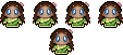
Posts: 8,335
|
Post by West on Jul 25, 2008 22:23:56 GMT -5
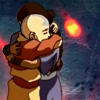
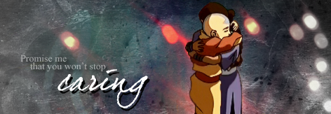
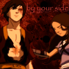
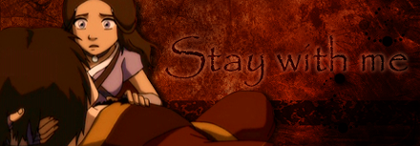
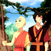
Here are the entries for this week (I even gave them funny names, like my contest memory): #1 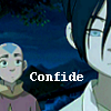 #2 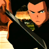 #3 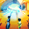 #4 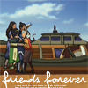 #5 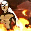 #6 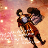 #7 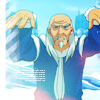 #8 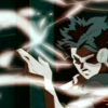 #9 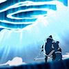 #10 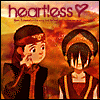 #11 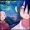 #12 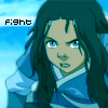 #13 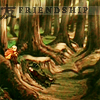 #14 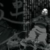 #15 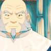 #16 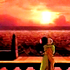  |
|
|
|
Post by notreal on Jul 25, 2008 22:53:34 GMT -5
1) The crop is nice and the text is well placed. However, there is no coloring at all and the text doesn't fit the icon. It is plain...Very nice crop, still, but it could have been done just as easily in Paint. =/ 2) Coloring seems a little off, the red tint to his skin isn't appealing to the eye. Still, nice crop, I like. 3) Very eye catching, however something could be done to make it a bit darker. =/ The colored over all are nice, but if the ground was given a darkened tint (Maybe in Curves, if you know how to use it) it would give the character's coloring a nicer contrast and make it over all more appealing. 4) I love the crop, text, and tiny text brush. ^_____^ The icon itself was extremely well done, however the lack of coloring leaves something to be desired. =/ 5) Interesting. Try saving the image as a PNG rather than Jpeg so the quality is a bit better. I personally don't like the texture much, but to each its own.  A bit over softened. 6) Well done! The crop is a bit boring, but it fits the icon well. I love the text, not over done, but still nice and eye catching. The texture is noticable but not texture raep. One of my favorites so far. :3 7) Not a bad icon, actually. The tiny text doesn't fit well, though, at least not in the spot you put it. Still, I like the icon. ^_^; 8) Mmm, very nice. Interesting but not over done. Could be sharpened a bit. 9) The quality is pretty bad, once again. PNG please. 10) LOL, this is pretty and not too bad an icon. My shipping preference aside, I really like this. The text color, pink, doesn't fit at all with the coloring of the icon, though. =/ A red would probably be better. 11) Once again, putting my ship aside, awesome icon.  The text kinda ruins it, though. Take out the text and you have yourself an awesome graphic. 12) I don't know what it is... It just seems to have a greenish tint that is unappealing to the icon's colores. The text is eh. 13) I *love* this icon! The perspective is awesome, good eye! Plus, the crop is nice. I get so tired of middle crops. Nice brush/text usage as well. A+ dahling. 14) Hmmm. Pretty nice! It'd be more eye catching if it wasn't gray scale, however, and it seems a bit busy. The style *is* kinda nice, though. Omg you people need to gimmee your brushes.15) Oh wow, the coloring is a bit bright. But nice crop. Keep working at it. 16) Coloring is very, very nice. Perspective as well. My choice for this week was 13. |
|
Kana
Yu Yan Archers 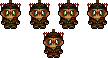

Posts: 5,728
|
Post by Kana on Jul 26, 2008 0:54:08 GMT -5
Hmmm. . . .
Everyone did a great job this week, but my favorites are 6, 9, and 11.
I have to say 6. It is well done, and I love the crop and colors.
|
|
|
|
Post by kyogoon on Jul 26, 2008 6:24:11 GMT -5
I like #10. It's funny, and nicely done.
|
|
|
|
Post by ILZ on Jul 26, 2008 17:21:41 GMT -5
#13 is really nice. All these icons are great and bring back great memories.
|
|
|
|
Post by tonnie on Jul 26, 2008 20:27:44 GMT -5
*cracks fingers* Here we go. #1- I think a lot more could've been done with the image. I also think the text grabs too much attention, and wasn't placed properly. :[ But I'll agree with Suki, it's a pretty good croop. :] #2- I'll agree with Suki when she says the red tint doesn't do this avvy much good. Nonetheless, it is still a good crop. #3- I wish Aang and Zuko weren't cut off. But the coloring is astounding, and this is definitely a fave moment! My favorite icon so far. #4- Aw, it's a sweet scene, but it could've used some nice coloring, make the colors more vivid. But the crop is nice, and the text is beautiful! #5- A moment that's definitely to be loved. I think it could've used a texture to brighten it, and the icon is a bit low quality. #6- I like the faded text, and the notebook texture in the background. This is another favorite. It's a well made icon, and I see nothing to criticize. :] I also love the text, it's an extra flare. #7- I'm not too fond of the white space at the left, and I think it would've been better without the tiny text. But I love the cropping, and the outer glow. It's not a bad icon, actually. #8- It's a good crop, but I think it could be sharper. I think some more could've been done with this screencap. #9- Oh, a definite favorite moment. That's where the journey started. Great crop, and this is a screenshot where nothing much needs to be added. I think a grunge texture could've been used here, but it's still pretty good. #10- It's a cute icon. I like the text, the tiny text, and the heart! The color scheme is pretty good. The animation isn't all that great though, the timing between each frame makes the punch seem a bit fake. ;P #11- I agree with Suki on this one. It's a pretty good icon with a nice texture, but it didn't need the tex. A pretty good icon overall though. #12- Once more, I agree with Suki. The tint makes it unappealing, and I'm not sure whether the text should've been in that font. #13- I couldn't read the word "friendship" at first, and I couldn't tell what the screencap was at first. But once my brain got it all figured out, I do think it's a well made icon indeed. Not bad. #14- Suki's right, this icon would've been a lot better with some color. But I like the text, and the cropping. A pretty swell icon in fact. #15- It is kinda bright, and I think it could've used a grunge texture, but that's just me.  It's pretty good, and the brightness makes it eye-catching. #16- Good scene. Sweet. The person who did this icon chosse a good screencap, because you don't have to do much to it to make it look good. It's fine on it's own. *reads above thoughts* Between 3 and 6... I'll go with 6. :] |
|
Deleted
Deleted Member
Posts: 0
|
Post by Deleted on Jul 26, 2008 20:57:47 GMT -5
A lot of these are really good, I useally pick by my shipping or chracter prefrence but I'm going to have to vote for number six even though its zutara it caught my eye first it so pretty.
|
|
|
|
Post by username on Jul 27, 2008 1:29:13 GMT -5
This week's selection is pretty solid. They're all at least decent, and some are very good, although none really blow me away. I think I'll go with 13. I useally pick by my shipping or chracter prefrence Why? All that does is throw off the voting and disregard talent and effort. |
|
Aanglover
Avatar Yangchen  The Aang Guru
 This isn't the end, but rather, a new beginning.
Posts: 1,537
|
Post by Aanglover on Jul 27, 2008 8:20:37 GMT -5
all of these are very very epic...
i'd have to say my favorite is 14 because that was one of my favorite scenes in avatar... and i love the calligraphy used as well.
|
|
|
|
Post by tonnie on Jul 27, 2008 11:38:43 GMT -5
West, if you don't mind me saying it here, I LOL'd at the names you gave the icons. Everytime I right clicked, I laughed. Especially #13- "waitingtoattackyoumuwahaha." *wipes tears of laughter* Nice.  And #6- "MotherTeresa." If we were to pick an icon based on the names you gave them, I wouldn't have been able to vote. |
|
Astronomy
Avatar Yangchen
Everyone loves a band geek.
Posts: 1,517
|
Post by Astronomy on Jul 27, 2008 13:21:37 GMT -5
#10 made me laugh. Plus, I liked the animation. #16's very pretty, and #5 is epic, but I had to go with #10.
|
|
|
|
Post by nymphadora on Jul 27, 2008 18:46:08 GMT -5
Ahhh I love the names - especially on 16. XDDDD
I voted for 6. I really liked the crop and it's one of my favorite scenes too.
|
|
|
|
Post by Scarlett Ember on Jul 27, 2008 18:57:10 GMT -5
I voted for 6 as well. I think the coloring and text is really nice, and it's also one of my favorite scenes.
4, 9, 10, and 13 are really good, too, but I can only vote for one. ^^'
|
|
Turbo
Toph  omglmao changed his name!
Posts: 164
|
Post by Turbo on Jul 27, 2008 19:02:51 GMT -5
I had to go with #14. That brush looks amazing with the crop. They were all lovely, some of the cropping and color was a tad off, but I still love them! Good job! |
|
Ilise
Buzzard Wasp  w00t, it's Jun
Posts: 503
|
Post by Ilise on Jul 27, 2008 20:29:45 GMT -5
14, 10, and 4 are all amazing. I'll have to go with 14, though - epic stuff. I liked 4's screenshot and 10's animation, but 14's maker did a great job on the effects themselves.
|
|

 A bit over softened.
 The text kinda ruins it, though. Take out the text and you have yourself an awesome graphic.


 It's pretty good, and the brightness makes it eye-catching.