Azula The Legend
Momo  Love is like an eternal flame, always warm and will never go out...
Posts: 47
|
Post by Azula The Legend on Aug 18, 2008 21:14:35 GMT -5
Your good at making graphics, keeep up the good work.
|
|
Hana
Avatar Roku  :3
:3
Posts: 1,204
|
Post by Hana on Aug 18, 2008 21:44:53 GMT -5
Umm . . . I'm not really sure what to make of that post. I don't really know what you mean by "art feeling based" and I'm not quite sure what "c4ds"are? =\ C4d's (cinema 4 d is the program used to make them) are a technique using images like this and using them as lighting or for an effect.  BTW, there is nothing wrong with your icons. They are always crisp and fresh to me. He probably doesn't understand that they are made with the "livejournal" style.  I don't really understand this guys style myself, although I do make expressive graphics for competitions/school. His example of one was bad seeing as I had to squint to see the focal point was a person. |
|
|
|
Post by beautyfr.pain on Aug 18, 2008 23:05:40 GMT -5
here's an example of what i mean by expressing a feeling, one that i made a long time ago  I must beg to differ with what you said here. Your banner seems to be an eye-pleaser to me. And his stuff still expresses certain feelings, like hilarity or disbelief. This isn't exactly the Lourve, they're pictures used as identities on the internet. What criteria qualifies your banner as "expressing a feeling" and west's stuff not? I'm agreeing with Hana. Your stuff would fit right in on LJ for sure. I've noticed from icontests and such that people on here aren't as used to it because I've seen really good icons made sort of LJ-style lose to icons with texture/coloring/text overkill. I beg to differ, my friend if he's trying to make a point, express, or get a cross a statement, he has a every right to use those expressions. In fact, i'd rather look at something with mor expression than more of a posed, or a "simple eye pleaser". It gives it more of an "active" feel. No offense, and i respect your opinion, but nah man.. I think Para is talking about like #16: 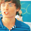 Troy's mouth is in mid-speech (or mid-song, it's HSM..), so it's not really saying anything, except that the screenshot wasn't ideal for an avatar. Personally, I think there's an overuse of selective coloring. I'm assuming that you probably use the same numbers in the coloring over and over again or something, and not every selective coloring method is going to look the same on every icon. I'm just glad you're taking the critiques in stride. It's not that your icons are total fail, they just aren't all the way there. Like this one:  I love the crop and the brush you used because it draws my eyes in, but i'm not a fan of the coloring or the blurriness. Either way, I'm sure your next icons will be great. :] |
|
|
|
Post by Paraiba Ocean on Aug 20, 2008 13:37:22 GMT -5
It looks like you ganked the textures Kalia (star-jrock) from LJ made for the icons like 1, 4, etc. from some of the Adam and Troy dumps. Not the best use of those textures, my friend.  ;; Half of your icons look like you just slapped textures or lens flares on them just so it'd have an effect. Every icon doesn't have to have an effect. Some of your images also featured them making very...strange expressions. Unless it's supposed to be humorous, try and avoid those. XD But don't feel bad because they're not all bad. : ) I beg to differ, my friend if he's trying to make a point, express, or get a cross a statement, he has a every right to use those expressions. In fact, i'd rather look at something with mor expression than more of a posed, or a "simple eye pleaser". It gives it more of an "active" feel. No offense, and i respect your opinion, but nah man.. BFP said what I meant. That image is mid-speech, so that's an awkward expression. XD;; Strange expressions like WTF, OMG, huh? I'm all for. I've made them. XD You just have to make sure they're not like, blinking or something while trying to say something. |
|
|
|
Post by sokitaraangmaiko on Aug 22, 2008 2:14:28 GMT -5
here's an example of what i mean by expressing a feeling, one that i made a long time ago I must beg to differ with what you said here. Your banner seems to be an eye-pleaser to me. And his stuff still expresses certain feelings, like hilarity or disbelief. This isn't exactly the Lourve, they're pictures used as identities on the internet. What criteria qualifies your banner as "expressing a feeling" and west's stuff not? I'm agreeing with Hana. Your stuff would fit right in on LJ for sure. I've noticed from icontests and such that people on here aren't as used to it because I've seen really good icons made sort of LJ-style lose to icons with texture/coloring/text overkill. I beg to differ, my friend if he's trying to make a point, express, or get a cross a statement, he has a every right to use those expressions. In fact, i'd rather look at something with mor expression than more of a posed, or a "simple eye pleaser". It gives it more of an "active" feel. No offense, and i respect your opinion, but nah man.. I think Para is talking about like #16: Troy's mouth is in mid-speech (or mid-song, it's HSM..), so it's not really saying anything, except that the screenshot wasn't ideal for an avatar. Personally, I think there's an overuse of selective coloring. I'm assuming that you probably use the same numbers in the coloring over and over again or something, and not every selective coloring method is going to look the same on every icon. I'm just glad you're taking the critiques in stride. It's not that your icons are total fail, they just aren't all the way there. Like this one: I love the crop and the brush you used because it draws my eyes in, but i'm not a fan of the coloring or the blurriness. Either way, I'm sure your next icons will be great. :] I beg to differ x 3. Dude, i never made a point to say that they DONT express emotion i said they could express a bit more, because thats what really captures my eye, and thats what captures a lot of peoples eyes, its attention grabbing and tends to make it more appealing, my friend i mean not to start an arguement, but i believe what you're saying is jumping to conclusions, and no offense..but naaaah man. Also gacs, i have no idea what you mean by over done? Ive had people on different sites tell me that it was a great sig. You also missed the point cOMPLETELY by saying that its not showing expression cause his face isnt showing. Im trying to say as in showing a feeling ,showing an emotion, showing something that is relating to you, or something about you, "Not to sound like an old man or something, but we must get over the idea that art is something merely pleasurable". I think that my sig has kind of a pondering feel. |
|
West
Finale Katara 
Posts: 8,335
|
Post by West on Aug 22, 2008 11:06:47 GMT -5
Guyyyys, this is not a thread for you to discuss different techniques about graphics, that goes in the Adobe Photoshop Thread. This is a thread where you talk about my graphics!!
Mwahahaha
|
|
|
|
Post by I need a good username! on Nov 15, 2008 9:26:57 GMT -5
Mwah ha ha!
I love your HSM graphics!
I need some! Can I request?
|
|
West
Finale Katara
Posts: 8,335
|
Post by West on Nov 15, 2008 11:15:11 GMT -5
Yuss, you can. Which you already did in my request shop! ;]
|
|
West
Finale Katara
Posts: 8,335
|
Post by West on Dec 12, 2008 19:47:38 GMT -5
Ok so here are 11 icons I found on my hard drive: [1] Sweeney Todd [10] David Archuleta 1)  2) 3)  4) 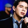 5) 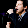 6) 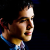 7) 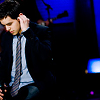 8) 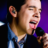 9) 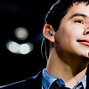 10) 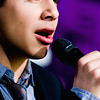 11) 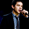 |
|
|
|
Post by beautyfr.pain on Dec 13, 2008 9:01:53 GMT -5
I love the Archie ones! They sort of look like bases, but I think the interesting crops make up for effects; if you added some, i think they'd end up looking to busy. The colors are really pretty though and he's gorgeous. where'd you get the caps/images for them?
|
|
West
Finale Katara
Posts: 8,335
|
Post by West on Dec 13, 2008 14:47:16 GMT -5
I guess that you could say that they could technically be considered bases, but the actual image itself had effects already on it, so I pretty much just cropped them.
They are taken from his performance at the AOL Sessions. If you go there, you can find his performances, and these 10 pics from it too.
|
|
West
Finale Katara
Posts: 8,335
|
Post by West on Dec 21, 2008 20:22:57 GMT -5
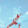
Ok, so I was going to work on another large dump of icons like I did before that Hok requested, so I whought that I would preview some and see what people thought. Any kind of comments would be nice: |
|
|
|
Post by beautyfr.pain on Dec 22, 2008 19:06:31 GMT -5
I really like 3 and 6, moreso 6, but that's because i don't usually have a strong opinion on graphics of a fandom i don't know/like. I would enjoy seeing more though ^_^
|
|
Sakura
FN Sokka  Sakura. Just Sakura.
Posts: 1,744
|
Post by Sakura on Dec 22, 2008 19:21:57 GMT -5
Enjoyment on simplicity! Sometimes, the most beautiful things in life are the most simple things you can imagine. ><
*inside* The guy in (4) looks liek Al! *squee*
Keep up the good work.
|
|
|
|
Post by syarafire on Dec 22, 2008 19:34:16 GMT -5
Ooooh, FFXII. ♥ ♥
They're really awesome! I especially like 1; the texture and the coloring are really well done.
|
|


 ;;
;;