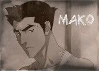
1) The focus and quality doesn't seem all that great. The crop is appealing, but not a fantastic icon in my opinion.
2) I like the perspective of this one. :3 Very nice pick for a screenie and crop.
3) The coloring is pretty nice, a little more work and the icon maker could become quite good. But, the background looks really washed out by the white splotch that's liek raeping it. That actually looks like what I used to do when I was misusing Curves. The input level was too high the the colors got washed out with white, do not want.
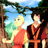
4) Pretty, I like the style. =D I think lowering the opacity on the eraser and taking a little off of the texture layer over Appa would make him stand out a lot more, though.

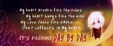
5) Nicely done on this one. I like the brush and text use, although the texture takes attention a way from the icon.
6) The coloring on this icon made it really hard to actually tell what it
is, to be frank. XD
7) Absolutely beautiful. Sharpened just right and the coloring is amazing.
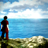
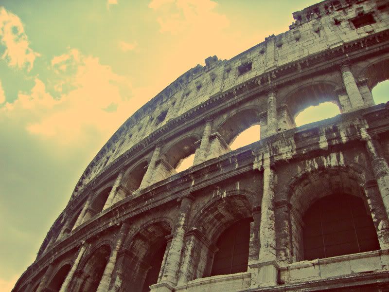
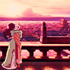
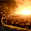
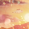
8) Oh, I love the contrast between the rocks and the sky. Very nice colors to work with and makes for a nice icon, coloring using warm colors like this always makes for a warm effect like this icon. =D The text and brush both fit nicely as well.
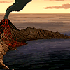
9) I love this. The crop, the coloring, and the sharpening is not over done. Really pretty.
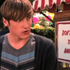
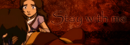
10) This screen cap is so over used, lulz. The border and text don't look good together in the same icon, either, and the text is a bit busy for my taste.
11) Hmmm, interesting. I like the over all effect of the icon. Again, though, lightly erasing the texture over the main focus (Sokka/Suki) would make it a bit better.
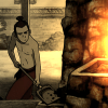
12) I have to say, I like the coloring and texture. It fits. However, he looks a bit too dark and his features are being washed out by it.
13) Very, very nice. =D I love the coloring.
14) Simple, but nice. The crop is cool.
15) This looks over darkened and over softened. Lulz. Also, your crop wasn't very even. When you re-sized the image it looks extremely squished. Saving as a PNG will also make the quality much better.
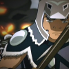
16) Nice texture usage, but the quality is lacking.
17) A closer crop to Appa might make him stand out a bit more.
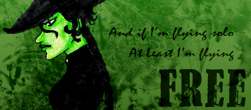
18) I actually kinda like this, the perspective is cool. ;D
19) Again, nice crop, but the quality is not very good.
My pick was number nine. ^_^
 #2
#2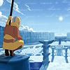 #3
#3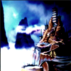 #4
#4
 #6
#6 #7
#7 #8
#8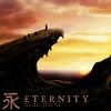
 #10
#10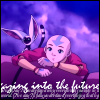 #11
#11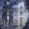 #12
#12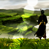
 #14
#14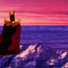 #15
#15 #16
#16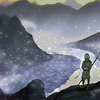
 #18
#18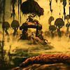 #19
#19